Situation:
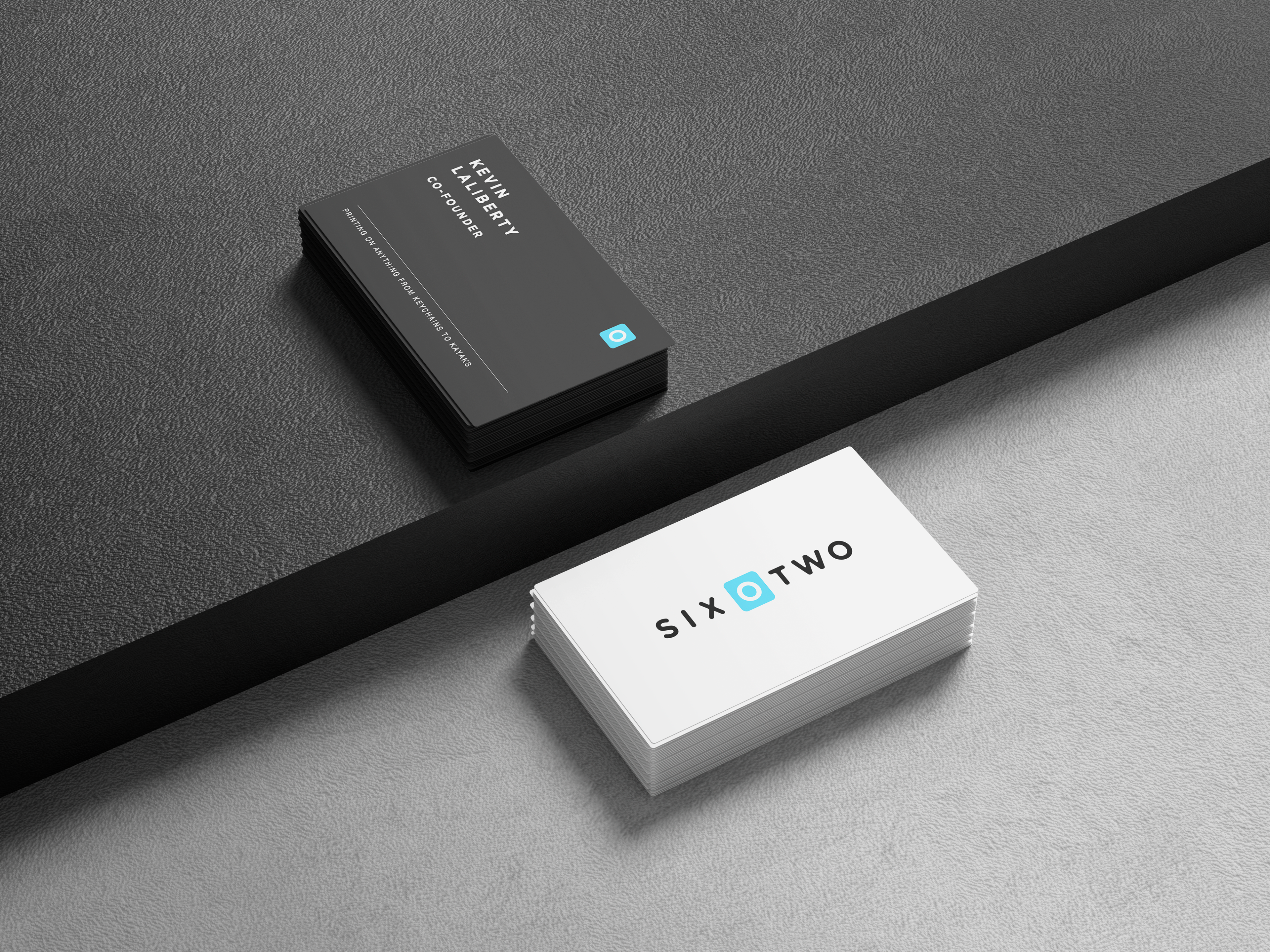
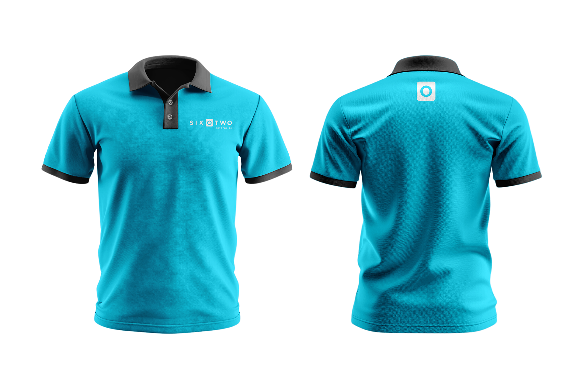
602 Enterprises, a growing small business in the promotion industry, wanted to refresh their brand identity to reflect their rapid expansion and position themselves as a strong competitor in their space. The brand, named after the apartment where the founders met in college, needed a logo that was modern, adaptable, and aligned with their vision of being experts in their field. The target audience primarily consisted of college students, but they also wanted the brand to appeal to corporate clients. The logo had to be versatile enough to be used across various mediums, such as email headers, business cards, and apparel.
Task:
The primary task was to create a logo that captured the essence of 602 Enterprises—emphasizing adaptability, creativity, and expertise—while ensuring it felt fresh and modern. The logo needed to resonate with both the youthful college demographic and the more professional corporate audience. Additionally, the design had to be completed within a tight timeframe of two to three weeks, as the company was eager to introduce their new brand identity to potential big clients.
Action:
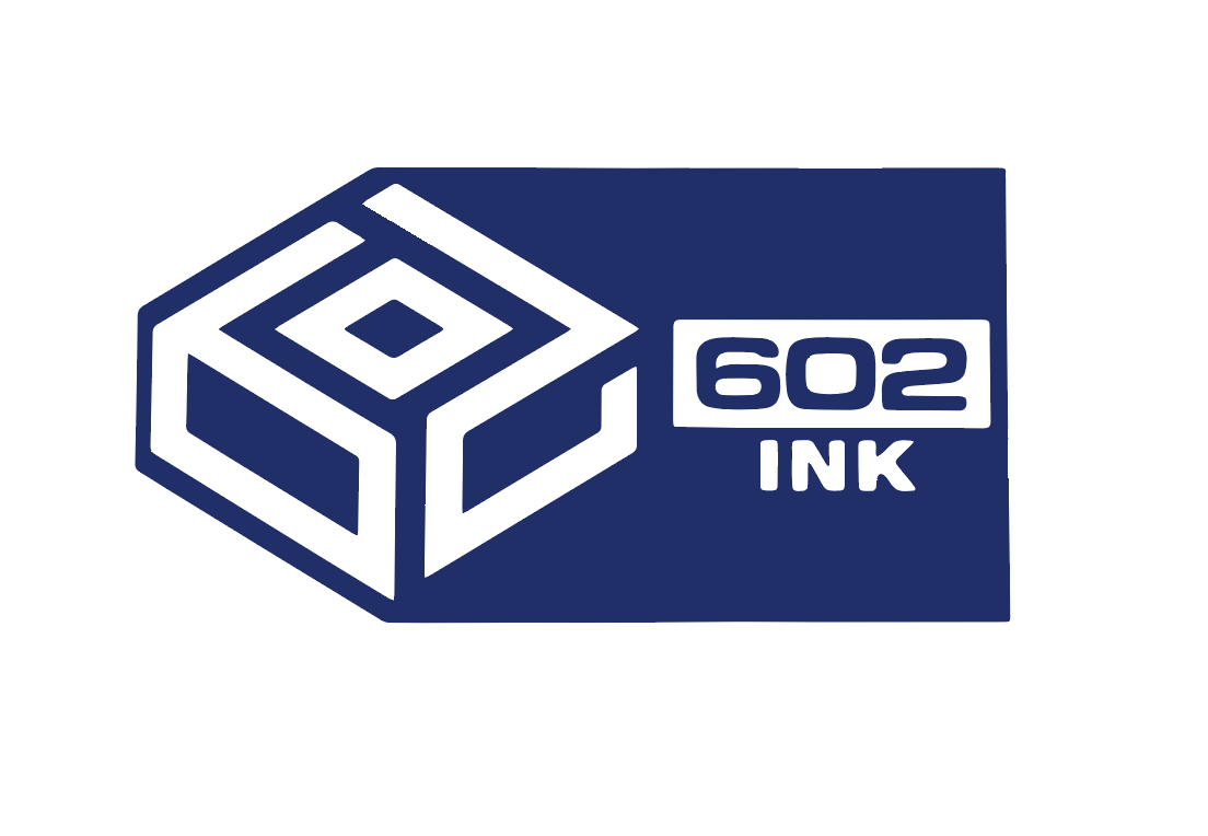
To achieve this, I collaborated with a colleague, Anton, to explore different design concepts. We began by considering the significance of the number "602," ensuring that the logo would reflect the brand's origin story and its connection to the founders' college experience. I focused on creating a logo that emphasized the "O" in "602," enclosing it within a box to symbolize the products the company sells—all of which come in boxes. However, I intentionally avoided boxing in the entire name to visually represent the company's value of thinking outside the box.
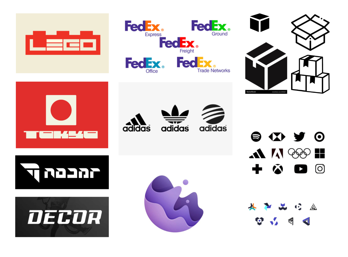
Anton, on the other hand, explored designs that incorporated fluidity, symmetry, and the apartment origin idea. Together, we developed a set of primary, secondary, and tertiary logos, inspired by brands like Adidas that use multiple logo variations to suit different aspects of their business. We ensured that the logo's blue color, reminiscent of the sky and water, aligned with the brand's values of fluidity and creativity.To address potential concerns about the readability of the "O" in the logo, I conducted an A/B test. The survey included two logo variations, with three other logos (including a control, Toys "R" Us) to assess how users perceived logos that played with shapes. This helped ensure that the final design would be easily recognizable and effective across various mediums.
Original Logo
I created a quick mood board of imagery that I felt could translate into my original design.
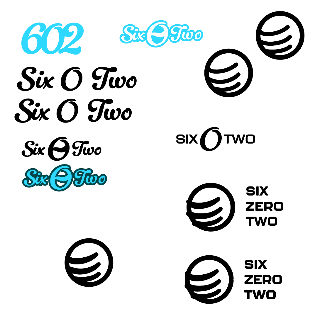
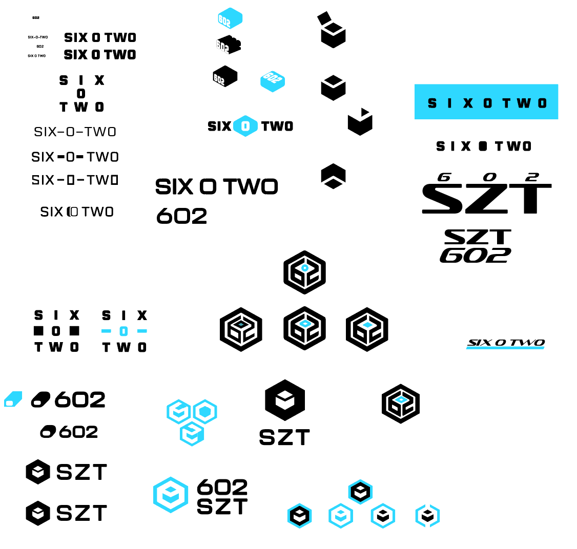
This was the first round of logos I started with. I was really focused on the concept of the box but played with some other symbols like the earth and network. Even trying to emphasize the name in different ways to give the client many options.
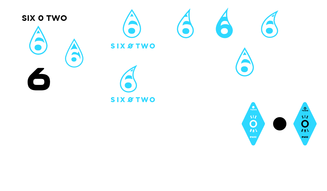
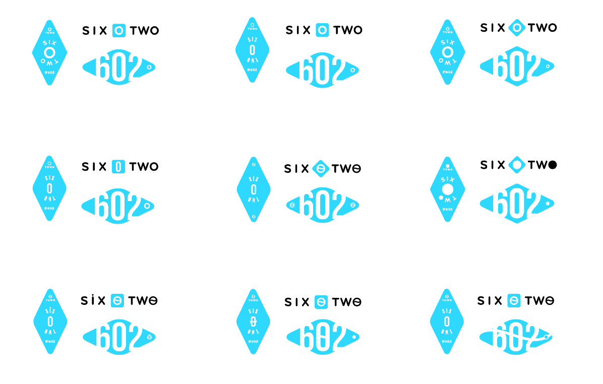
This was the last round of logos that should a mix between what another designer started combined with my own ideas. We are creating a set of logos they can use across their different needs.
Result:
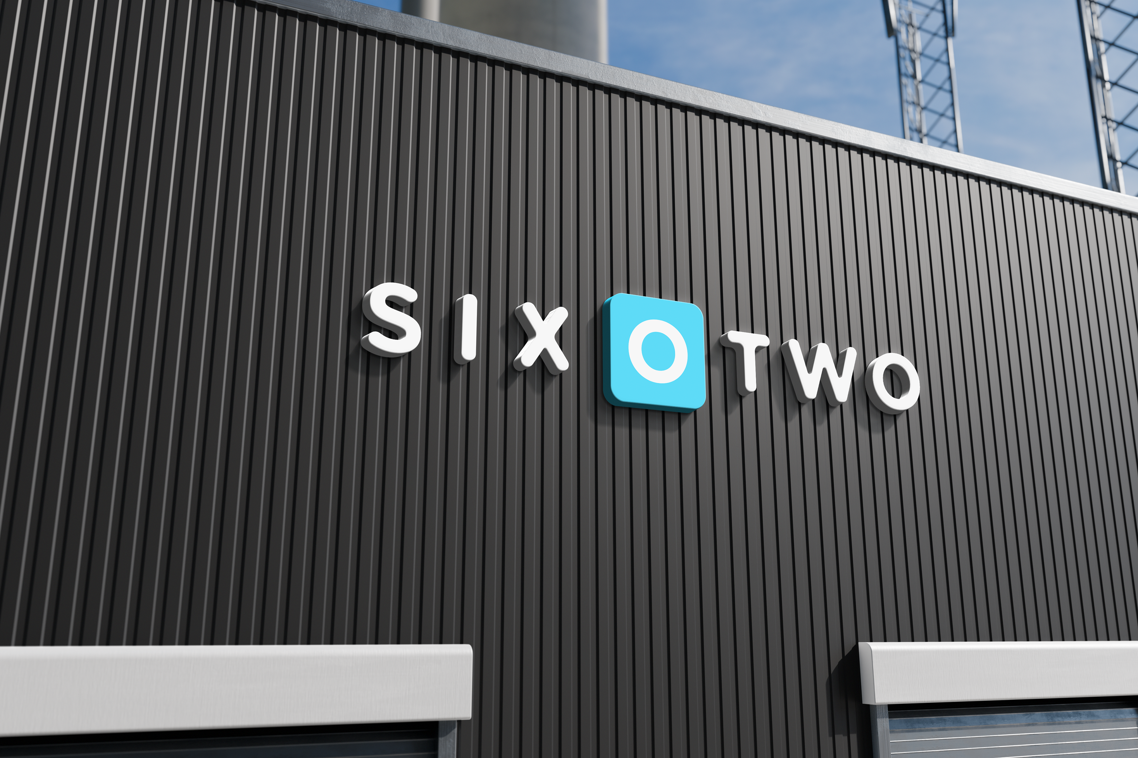
The iterative design process, combined with data-driven feedback, led to a logo that met the client’s needs and exceeded their expectations. The final design was simple yet versatile, ensuring scalability across different mediums and maintaining a modern appeal. The client was particularly pleased with the flexibility of the design, allowing for future growth and adaptation. The A/B test results showed promising signs that users could easily recognize the "O" as a zero, validating the design choice. Ultimately, the new logo positioned 602 Enterprises as a fresh and competitive brand in their industry, ready to engage both college students and corporate clients alike.