
Situation:
Timbertech is a pioneering app offering users an immersive 3D experience to envision their ideal outdoor spaces. As part of a broader initiative that includes kitchens, bathrooms, and living rooms, Timbertech allows users to explore diverse deck layouts effortlessly. I was tasked with enhancing the user experience by redesigning the menu to better showcase rail options. The challenge was to integrate legacy content from a previous app version while balancing the need for consistency with our UX standards and accommodating the client's new content.
Timbertech is a pioneering app offering users an immersive 3D experience to envision their ideal outdoor spaces. As part of a broader initiative that includes kitchens, bathrooms, and living rooms, Timbertech allows users to explore diverse deck layouts effortlessly. I was tasked with enhancing the user experience by redesigning the menu to better showcase rail options. The challenge was to integrate legacy content from a previous app version while balancing the need for consistency with our UX standards and accommodating the client's new content.
Task:
Redesign the menu to better display rail options for enhanced product visualization.
Redesign the menu to better display rail options for enhanced product visualization.
Action:
In redesigning the menu, I focused on Nielsen Norman’s first two usability principles, which are foundational to creating intuitive and user-friendly interfaces.
In redesigning the menu, I focused on Nielsen Norman’s first two usability principles, which are foundational to creating intuitive and user-friendly interfaces.
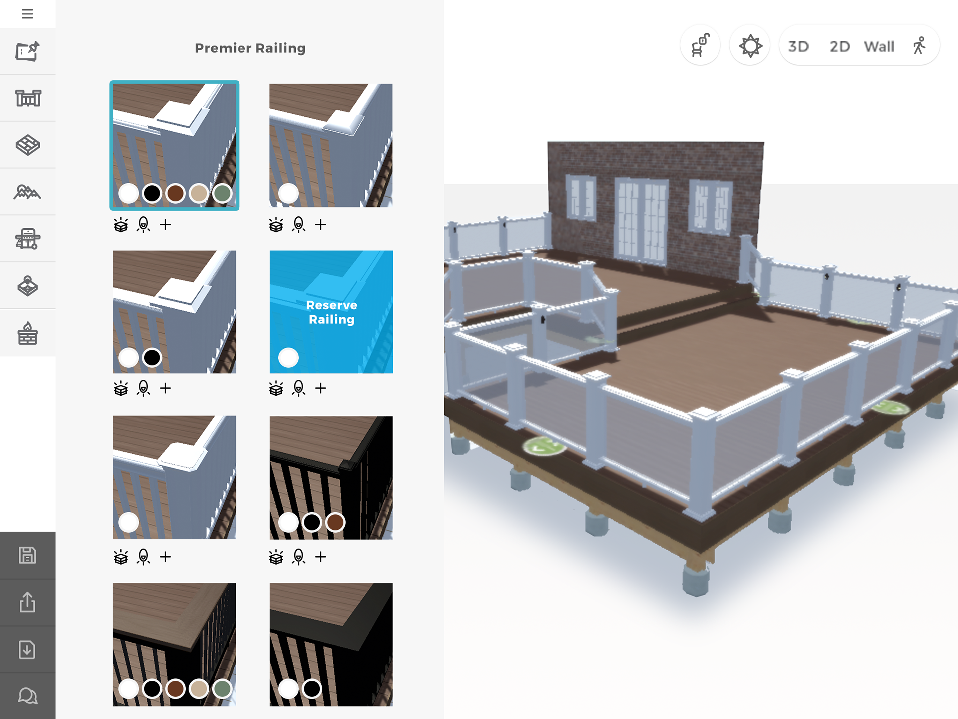
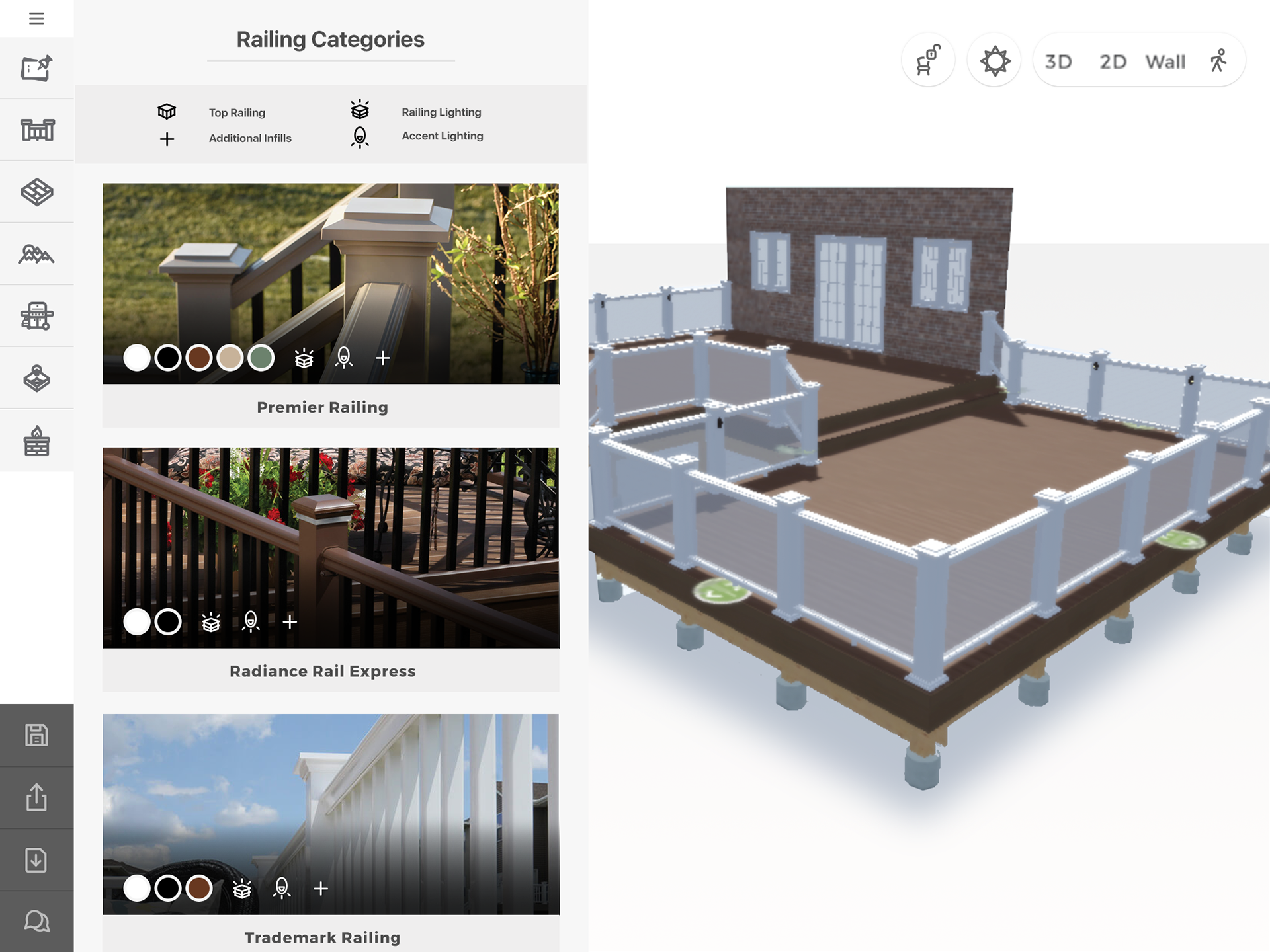
Visibility of System Status: This principle emphasizes the importance of keeping users informed about what is happening within the system through timely and clear feedback. In the original version of the Rail Builder, users were left with minimal information about the functionality of the rail options, making it difficult for them to make informed choices. To address this, I introduced an icon system that was integrated into the initial images. This provided immediate visual cues, letting users know what they could do with each rail option before even entering the rail builder. By making the system status more visible, users gained a clearer understanding of their choices, which reduced uncertainty and improved the overall user experience.
Match Between the System and the Real World: The second principle stresses the importance of designing interfaces that reflect the real world, using concepts, language, and visuals that users are familiar with. This helps bridge the gap between the digital environment and the user's expectations, making the system more intuitive. The previous version of the app relied heavily on rendered images, which often failed to provide a realistic sense of what the final product would look like. To enhance this, I replaced these renders with actual photographs of the rails, using as much real-world imagery as possible for the main images. This approach allowed users to see real-world examples of the rails, making it easier for them to visualize how the finished deck would appear. The familiarity of real images helped in building trust and aligning the digital experience with the physical product, which is crucial for user satisfaction.
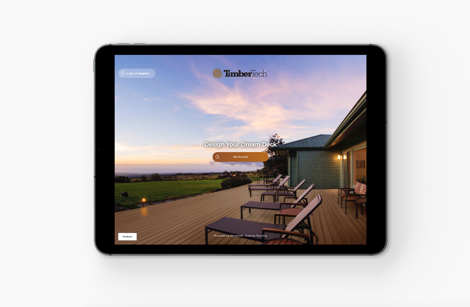
Timbertech Home Page
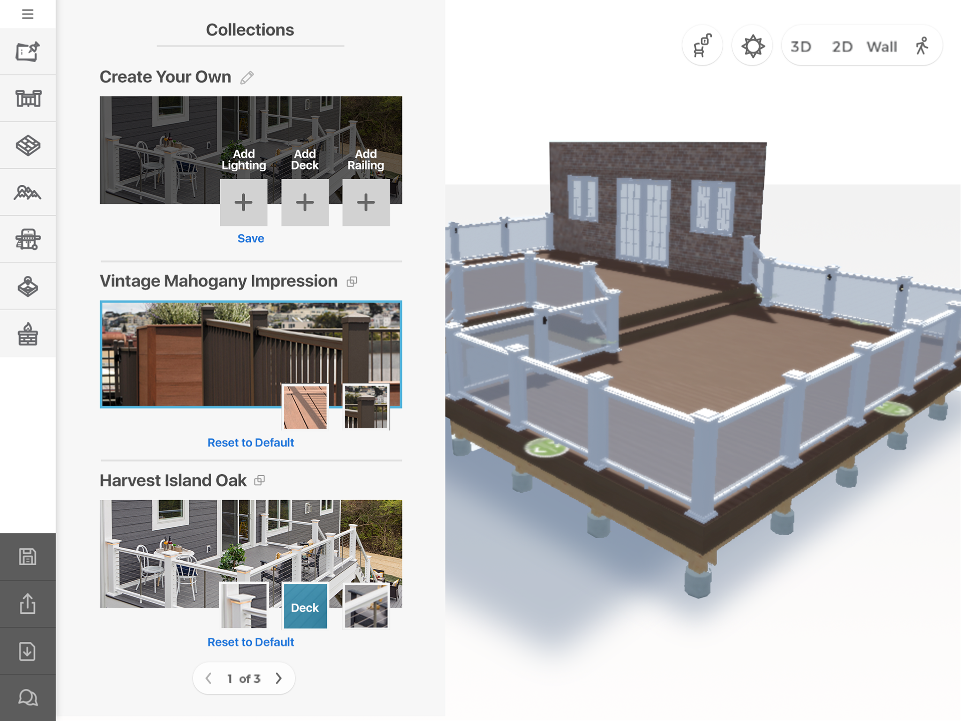
Menu Variations
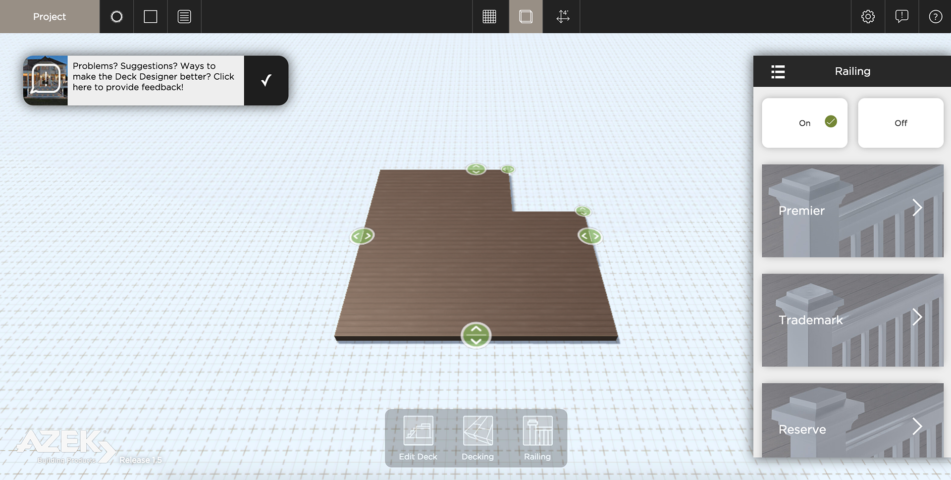
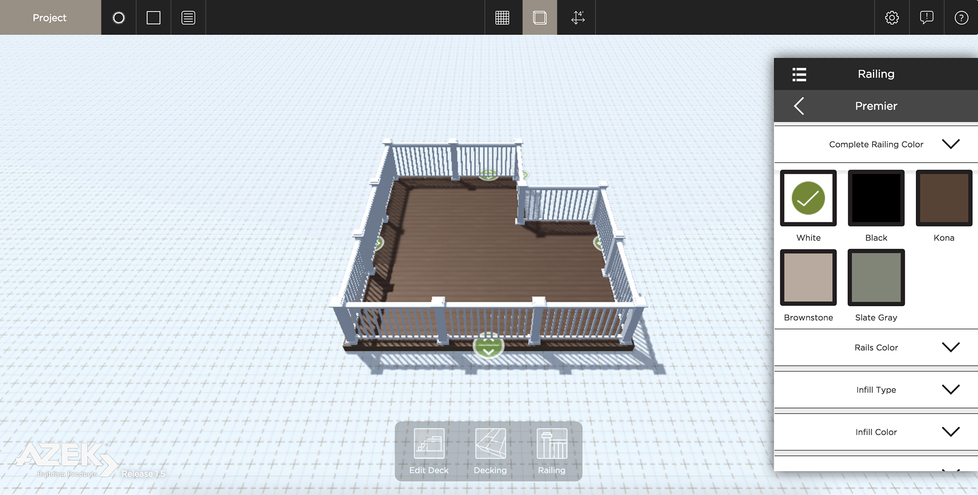
The legacy app before it was redesigned.
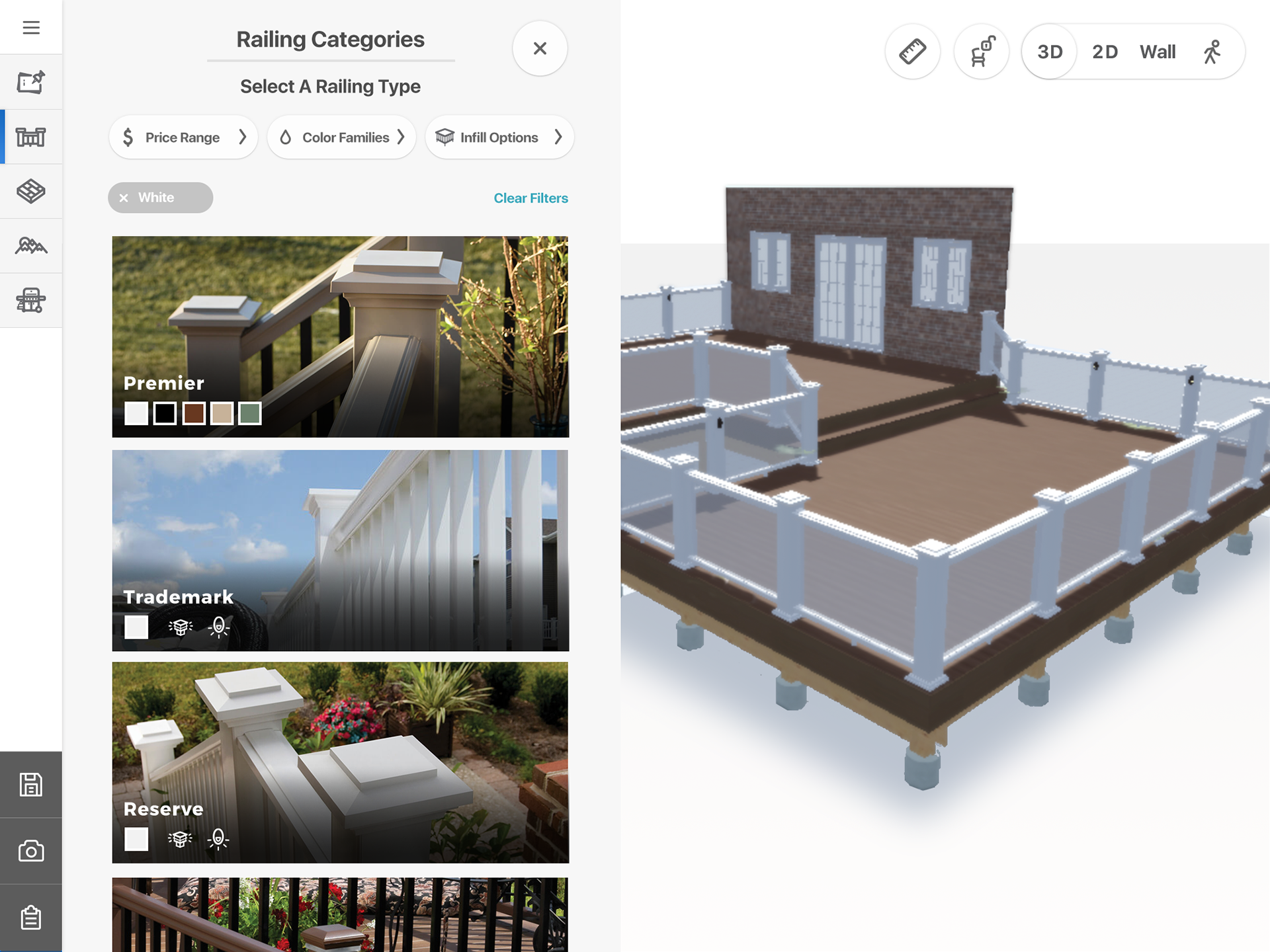
Hi-Fid Wireframes (Final Design)
Results:
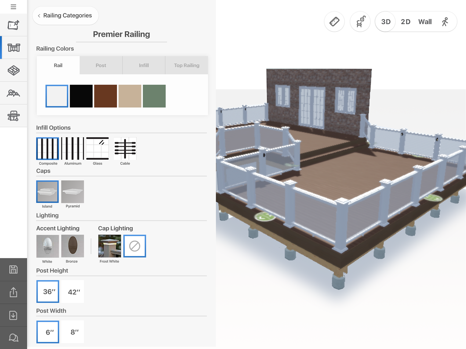
When users clicked into a category, they could see all the different interchangeable items within that railing. Major changes included grouping categories by functionality. Originally, categories had different color options, light, and dimensions separated.
The redesign resulted in a layout that not only maintained consistency but also enhanced user engagement by presenting more informative and realistic visuals. Categories were reorganized by functionality, and all color options were grouped at the top for easy access. By aligning characteristics with the client’s website, the transition from the home website to the deck designer app became more seamless, ultimately improving the overall user experience.
By focusing on these two principles, the new design made the Rail Builder more intuitive, user-friendly, and aligned with users' real-world expectations, leading to better decision-making and a more satisfying experience.
To see the live web app, check it out here.