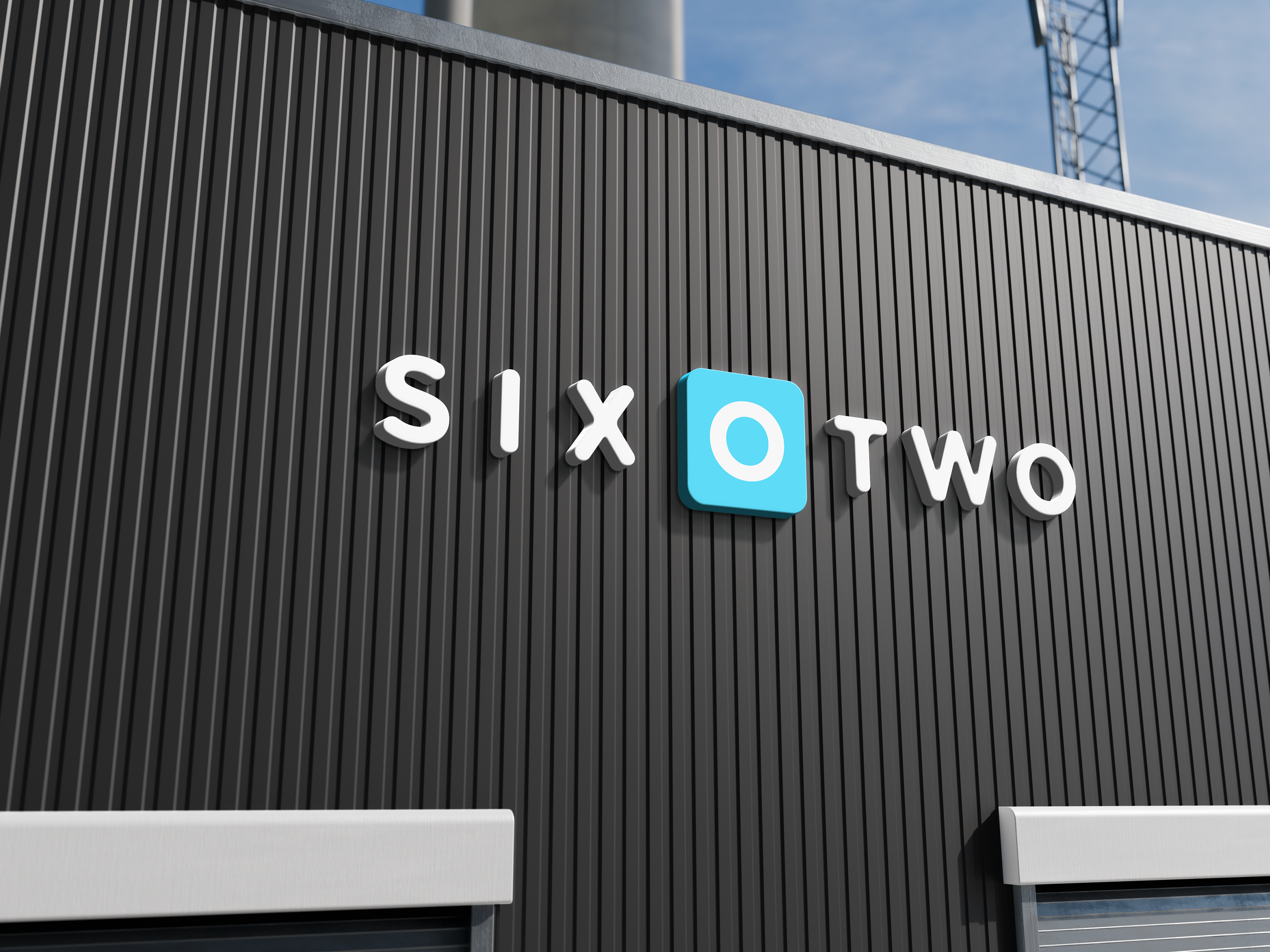
The client, a small business owner, realized there was a significant market gap in their B2B segment and wanted a label design that would reflect their brand well and help their products stand out against the competition. Blue Lotus primarily sells B2B but aims to eventually enter the general consumer market, so the label needed to satisfy both areas. The client had a deep personal connection to the color blue and wanted to ensure this was incorporated into the design.
The task was to create a label design that would stand out on the shelves of major retailers like Target while maintaining the brand's identity. The label needed to appeal to B2B clients in the nail salon industry and future consumers in broader retail markets. The design had to be versatile enough to work with various scents, with the only constraint being the requirement to keep the heart within the logo blue.
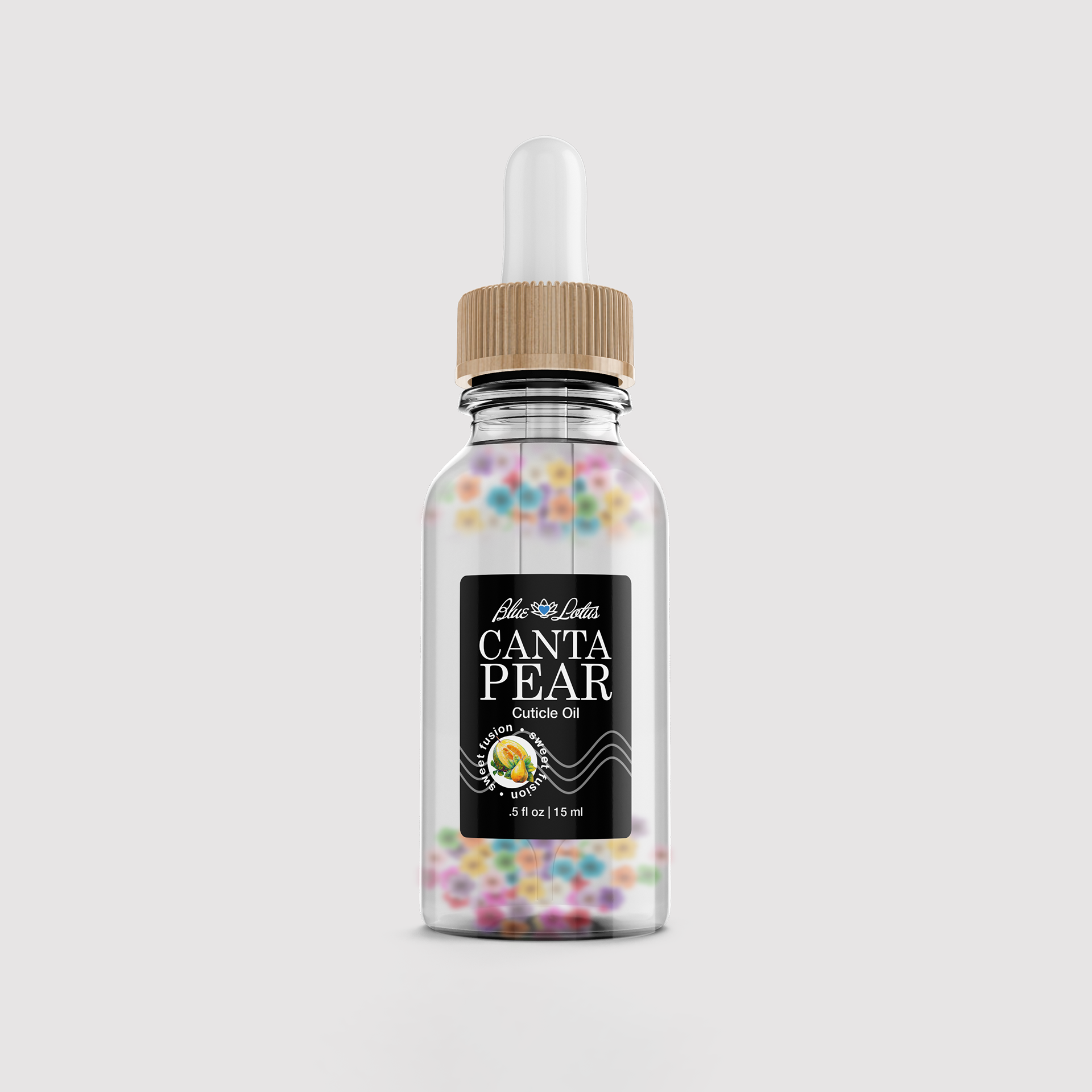
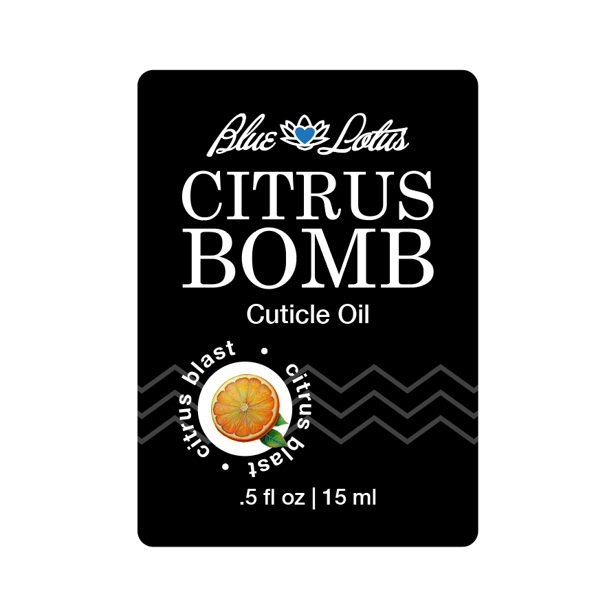
To tackle the task, I conducted thorough market research, visiting Target to analyze competitor products, particularly feminine and cuticle oil products. I observed that women’s products were generally more detailed and colorful, while cuticle oil products were more straightforward. I initially considered a minimal white label but realized it would blend in too much. I opted for a black minimal label that would make the product stand out while still highlighting the flowers inside the bottle, similar to competitors. The design focused on the name of the product, with minimal imagery, ensuring it stood out while respecting the brand's identity.
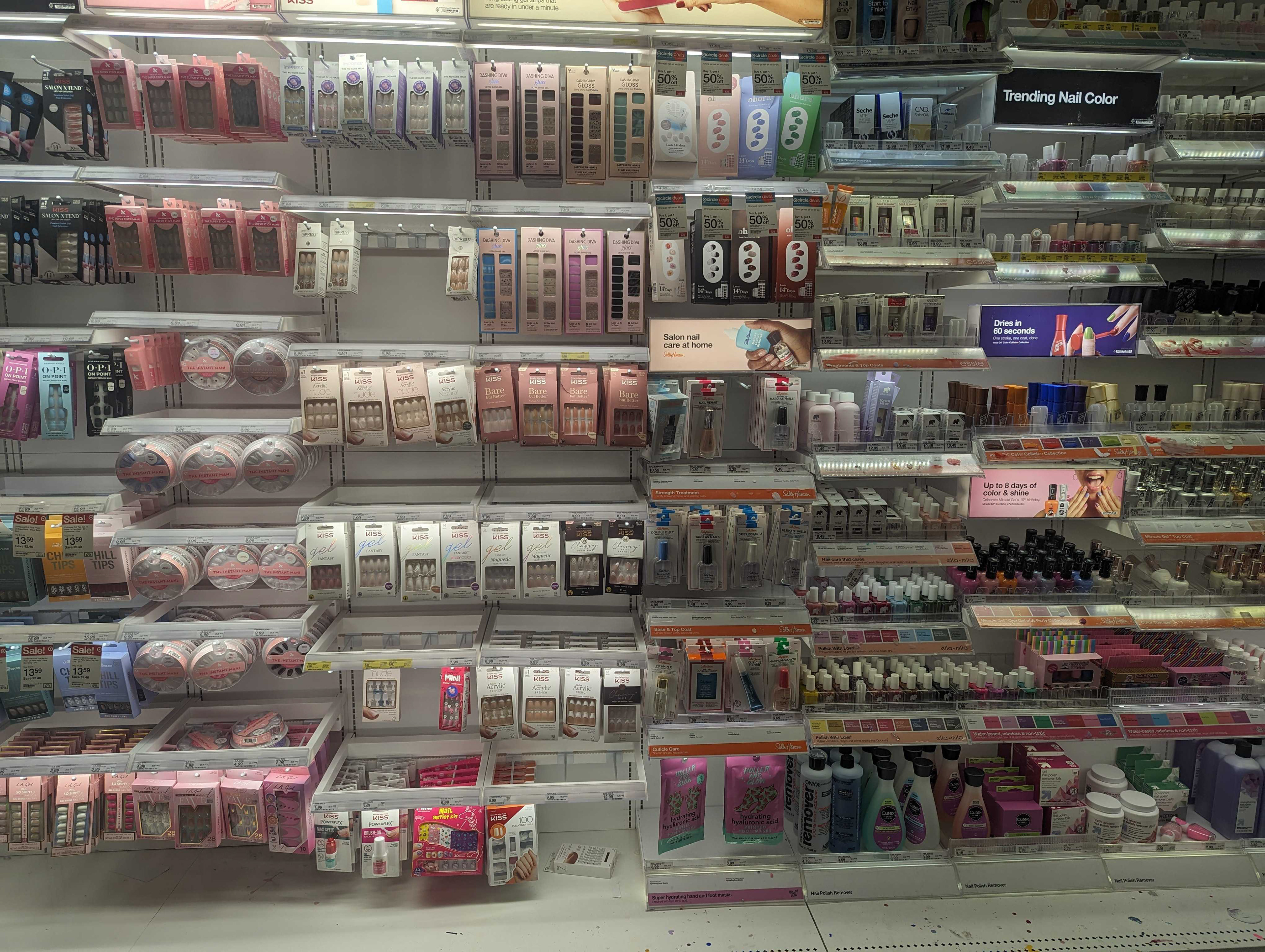
This was the shelf I had to picture the product sitting in.
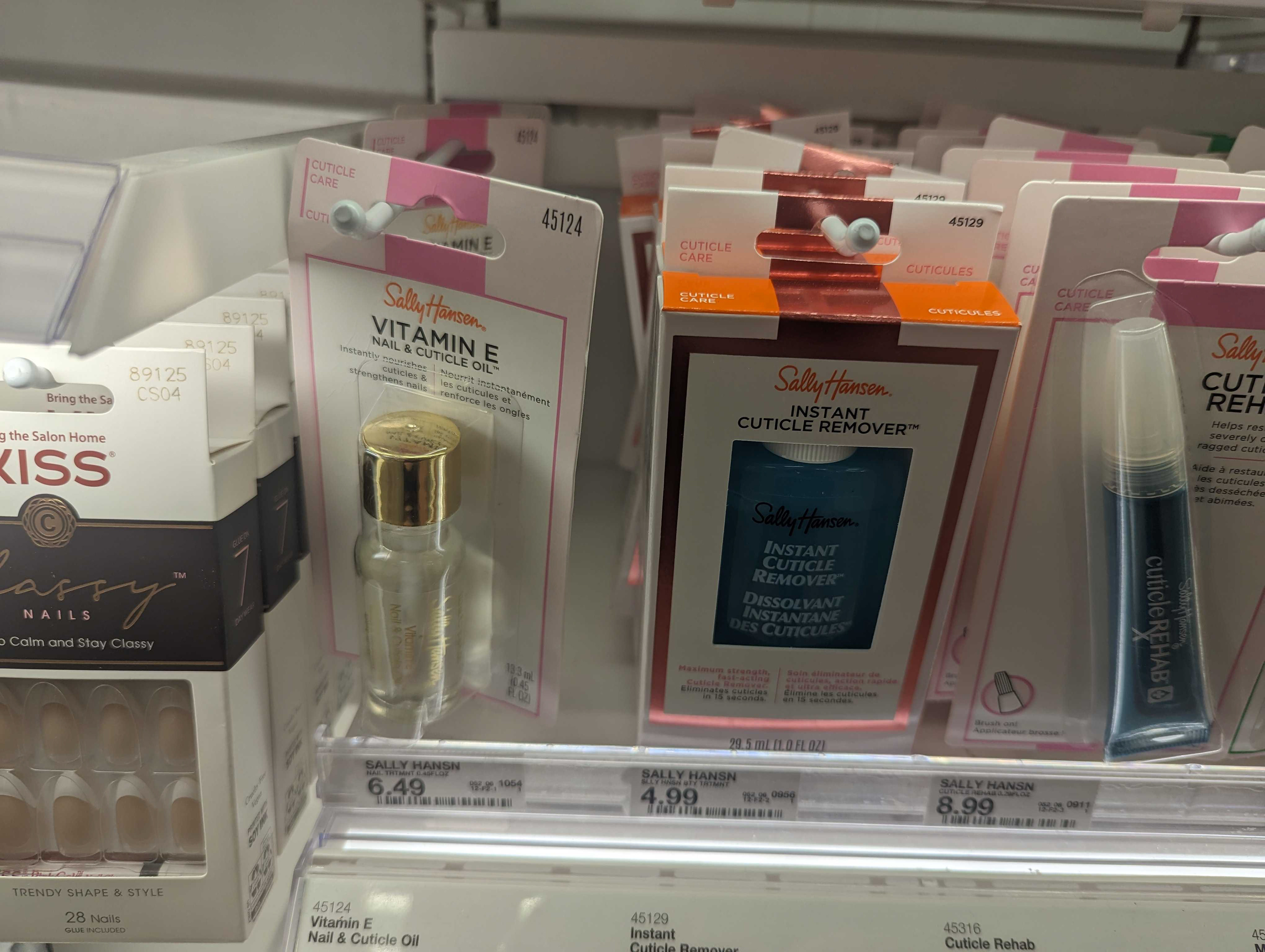
This was the only cuticle oil being sold at Target in this particular store.
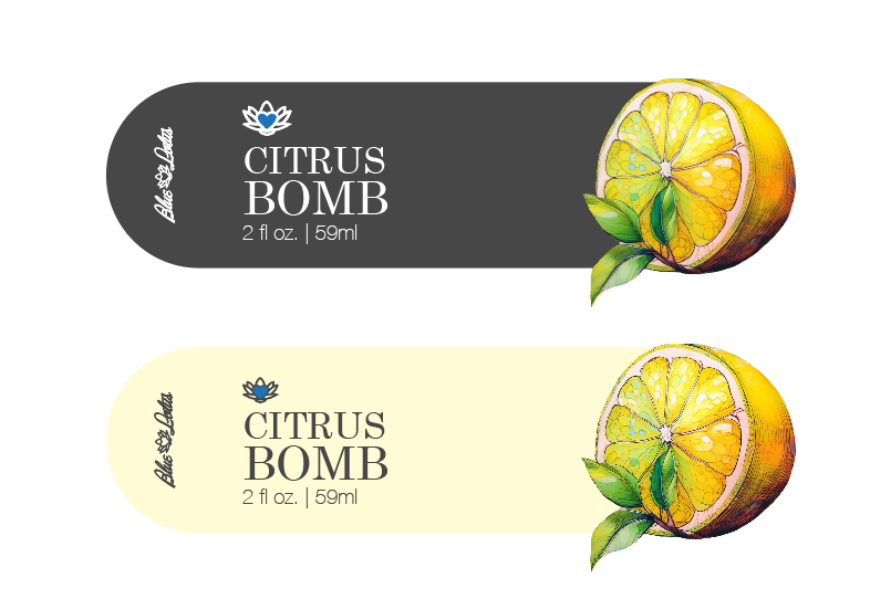
I started with a label that would wrap around the bottle. On one side you could easily see the name and on the back it would show the fruit. My thought process was that even if the bottle was turned the wrong way you could see what the product was but the client wanted everything to be front facing.
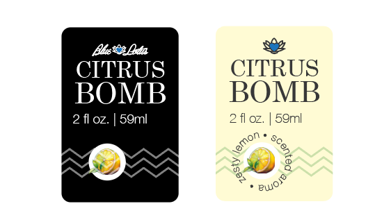
Here I started to hone in on the clients expectations and I received good feedback from my team. I went from an off black to a rich black because I saw how the black printed and I had realized that after spending so much time in digital, my printed version was going to come out different. The off black color looked like a washed out black which I didn't feel was right for the brand so I went for a more rich black.
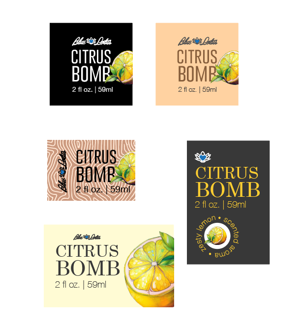
Here I started to play with other variations of the label.
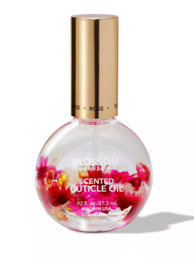
This was the competitor product we were competing with.
The final design met the client's needs and expectations, with the black label being well-received from the first presentation. The client was onboard with the design approach, and no significant revisions were required. The label effectively balanced the client's desires with the creative vision, resulting in a product that stands out on the shelf and aligns with the brand’s goal of appealing to both B2B clients and future consumers.