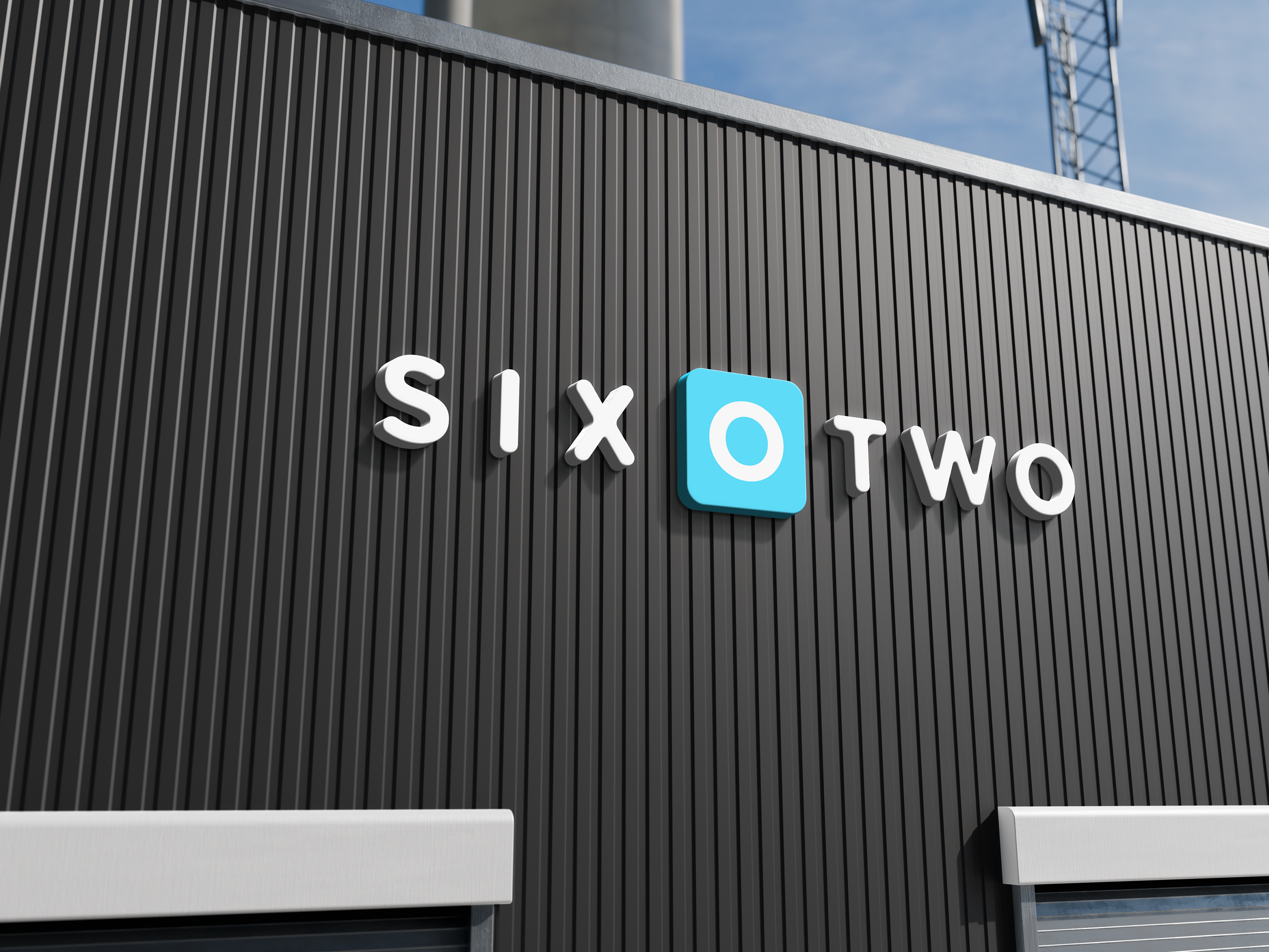
Cupa Coffee, a brand focused on being affordable and community-oriented, wanted to redesign their coffee labels to reflect their unique values. The client had previously designed the back labels in Canva but felt it didn’t fully represent the brand’s vision of being approachable yet slightly elevated. The challenge was to create a design that was modern, detailed, and reflective of the coffee, while being constrained by the printer's capability to print only in black.
The primary task was to redesign the coffee labels to align more closely with the brand’s goals. This involved creating a modern and cohesive design that emphasized the coffee's quality while maintaining the brand’s approachable and elevated feel. The packaging needed to be visually appealing enough to attract both coffee enthusiasts and those new to coffee, with a focus on recyclable and reusable materials. We only went through one revision process because the initial process was so thorough that the client was happy after the first presentation.
To achieve the desired outcome, I began by reviewing the interview notes and the client's initial designs. I then developed a mood board inspired by the clean, elevated look of dispensary shops and the aesthetic of soccer jerseys, which the client agreed with. I experimented with various design variations, focusing on showcasing the coffee details and flavor notes prominently. I incorporated the brand colors, pink and yellow, where possible, and ensured the design would work within the printer's black-only constraint. Throughout the process, I maintained close communication with the client, incorporating their feedback and making necessary revisions. I also ensured all content was accurate by proofreading and validating it with the client before finalizing the design. A big part of this project was in the final phases of the design. I always like to proofread content especially if it is going to be printed and that came in handy in this project. One of the few feedback pieces I got was that some of the information that was included in the design was wrong. This was surprising because I had gone off the original document I was given. It turned out that the original document had some inconsistencies that were not caught initially but because I had proofread the content and had asked the client to proofread my final design before being sent to the printer it was able to be caught.
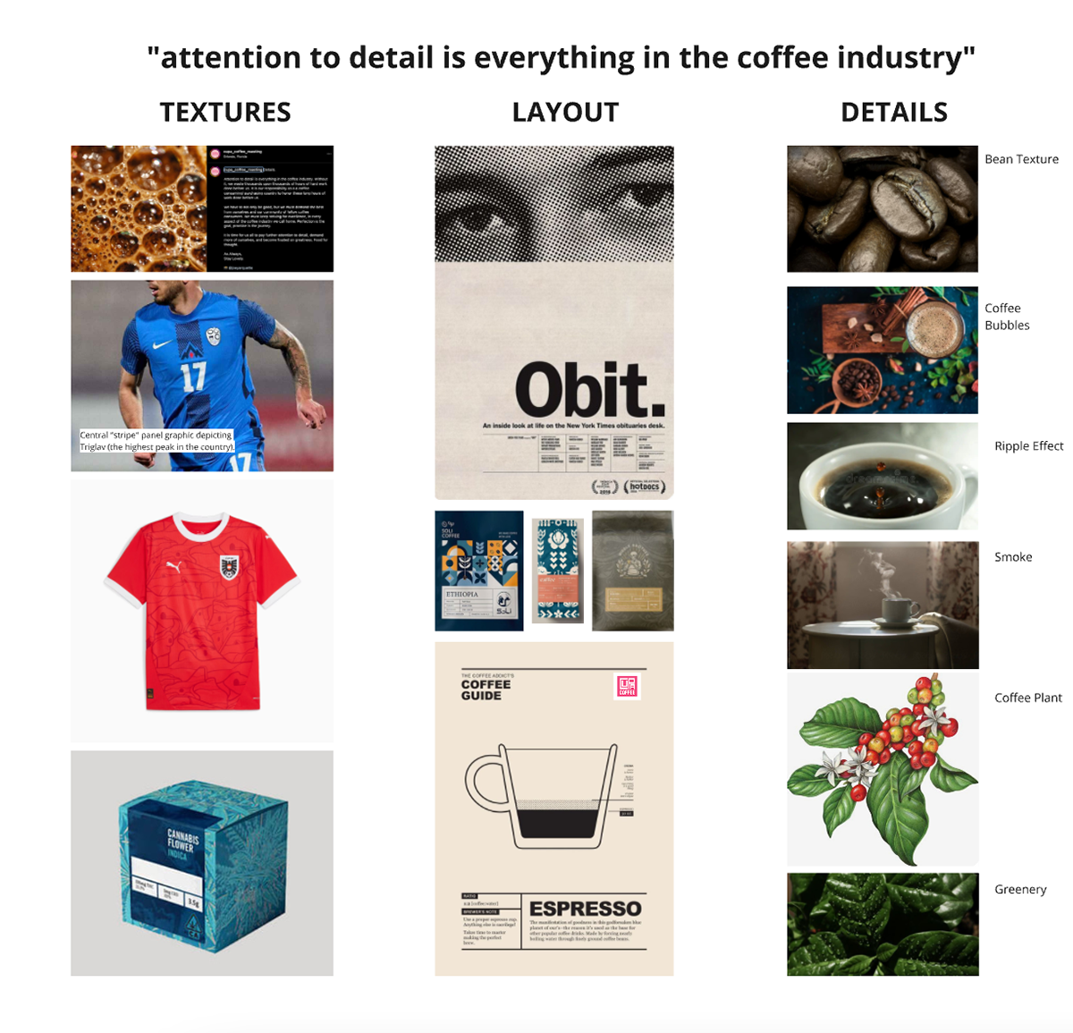
This mood board captured a lot of what the client had mentioned was important to them. One of the most important quotes that stood out during the initial interview was the phrase "attention to detail is everything in the coffee industry" and I wanted that to be apparent in the final designs.
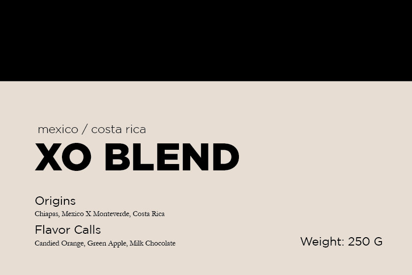
This was my initial version of the design where I first started to lay thing outs.
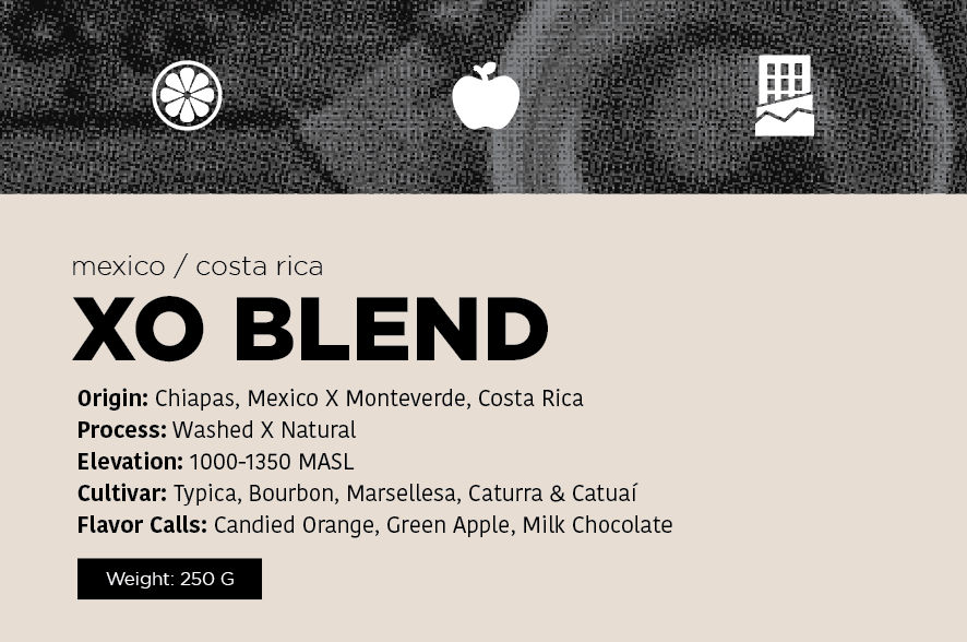
Here I started incorporate a lot of the different details about the coffee, but I felt like the information need more hierarchy.
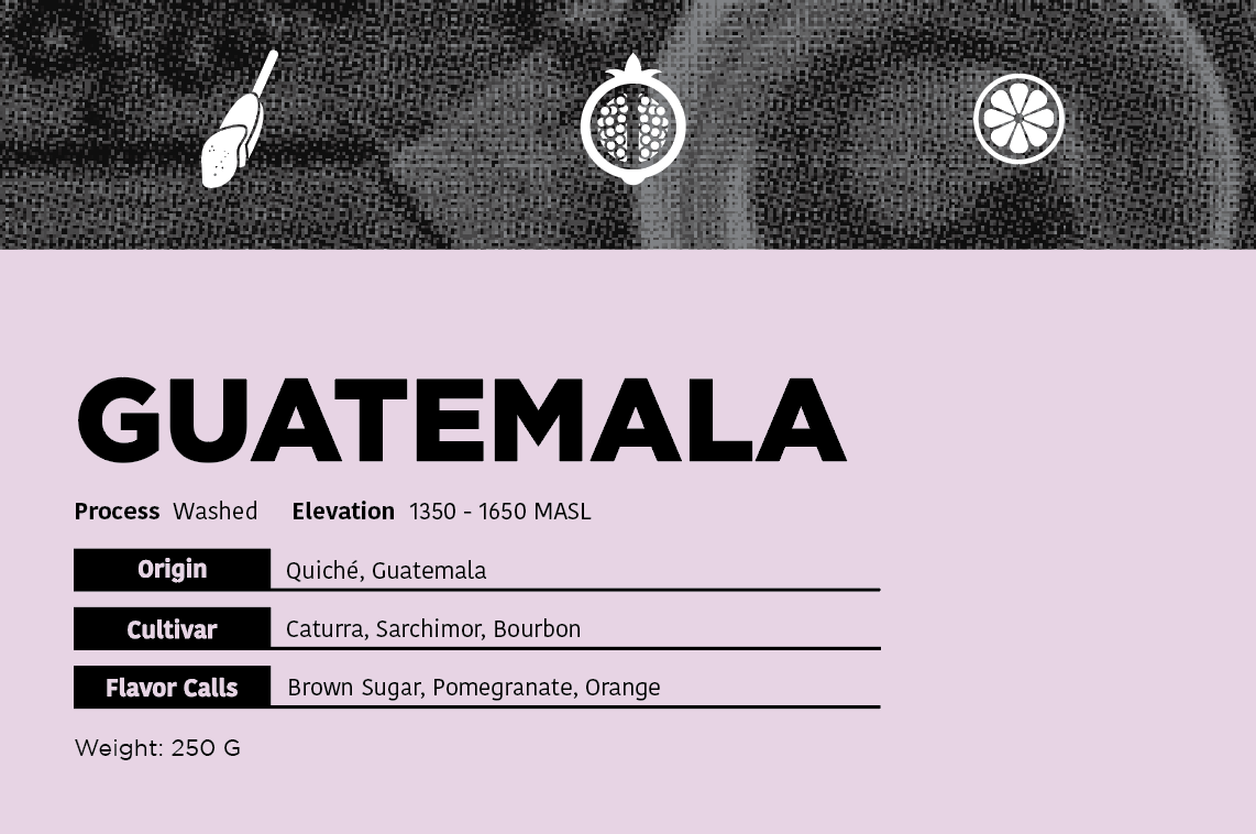
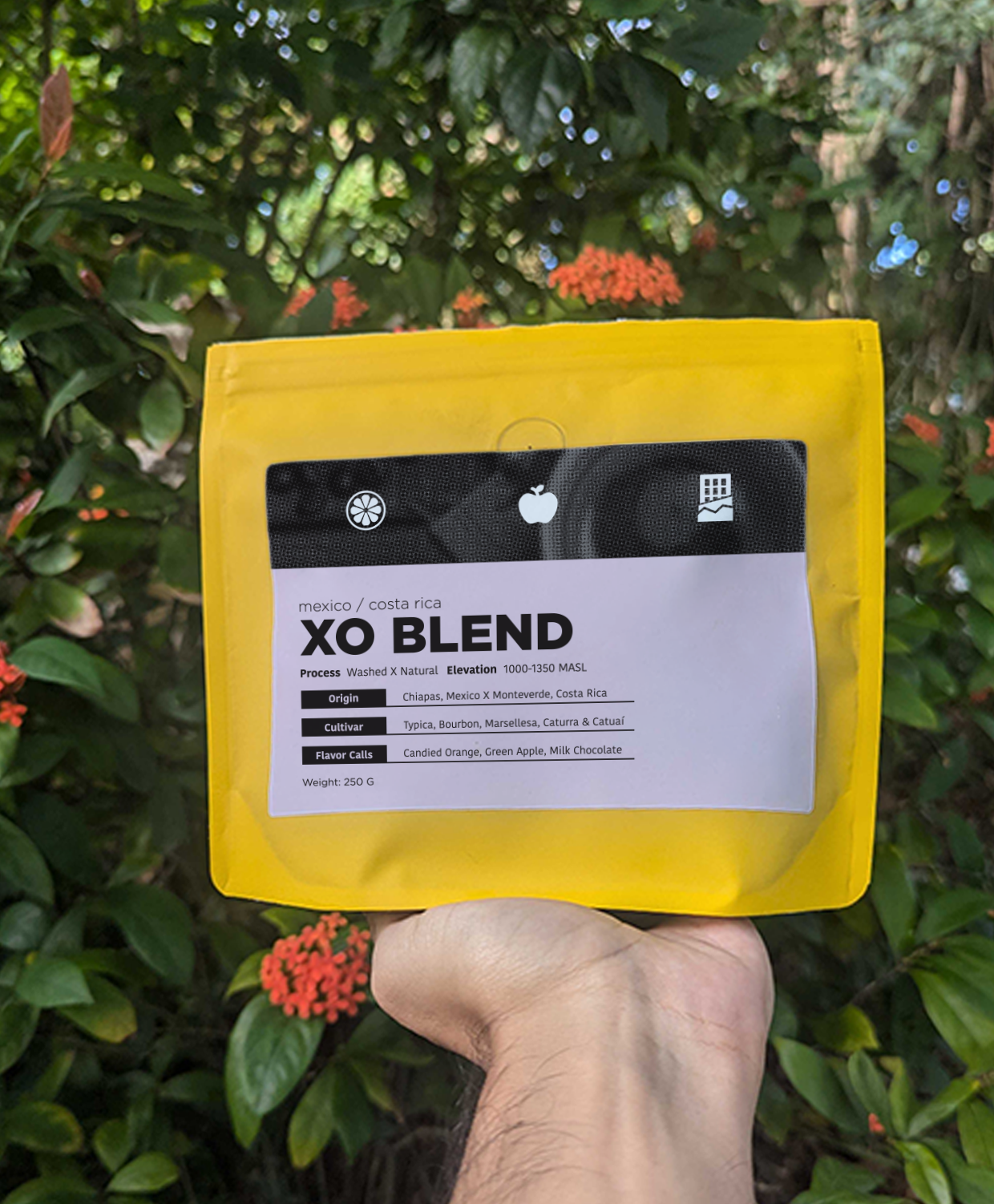
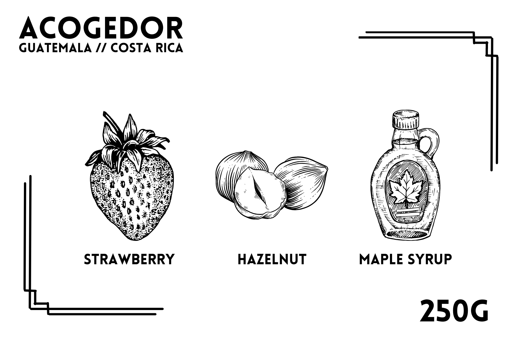
This was the final version of my design where I felt that I incorporated a touch of detail to coffee itself while still being informative and fun.
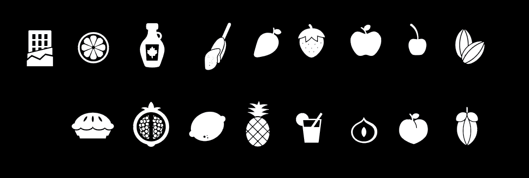
I had to create a whole icon system for every bag, some icons were a bit tricky but with some finesse I was able to encapsulate all the different ingredients that made up the flavors within the coffee.
The final design successfully met the client's expectations, aligning with the brand's values of being affordable, approachable, and slightly elevated. The new labels were not only more cohesive with the brand identity but also attracted the target audience, particularly fourth-wave coffee lovers. The client was pleased with the modern design that highlighted the coffee’s details, and the packaging achieved the desired balance between being approachable and elevated. The involvement of the client throughout the process ensured a smooth collaboration, and the project was completed without any major constraints or limitations.