Situation:
ProTrainings needed a more efficient and user-friendly payment processing experience for their course selection system. The existing version was overly complex, leading users to frequently enroll in the wrong courses or struggle to understand how many courses they were signing up for. This often resulted in users needing to call customer support for guidance, which defeated the purpose of the system's wizard functionality. The absence of a designer's input during the original development phase contributed to these issues, as the design did not effectively communicate the process to the users.
ProTrainings needed a more efficient and user-friendly payment processing experience for their course selection system. The existing version was overly complex, leading users to frequently enroll in the wrong courses or struggle to understand how many courses they were signing up for. This often resulted in users needing to call customer support for guidance, which defeated the purpose of the system's wizard functionality. The absence of a designer's input during the original development phase contributed to these issues, as the design did not effectively communicate the process to the users.
Task:
Redesign the initial payment processing experience to make it more intuitive and user-friendly, while ensuring that users could easily understand and navigate the course selection process without needing to call for support.
Action:
In this project, we focused on two key principles from Nielsen Norman’s usability heuristics:
In this project, we focused on two key principles from Nielsen Norman’s usability heuristics:
Visibility of System Status (1st Principle): This principle emphasizes keeping users informed about what is going on, through appropriate feedback within a reasonable time. In the previous version, users were often confused about where they were in the process and how many courses they were selecting, which led to a lack of clarity and confidence in their actions.
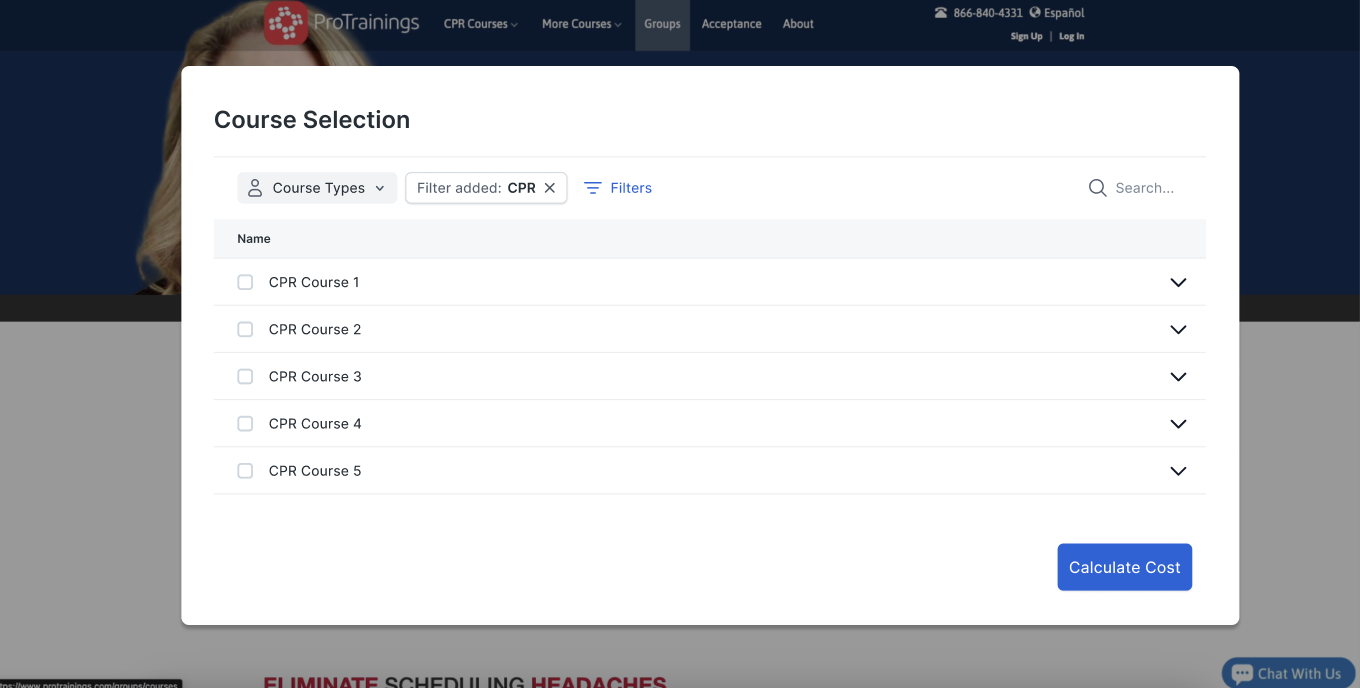
To address this, I redesigned the interface to make the process clearer and more transparent. By using a minimalistic design approach, I ensured that users only saw the information they needed at each step of the process, avoiding any unnecessary clutter or overwhelming details. This allowed users to easily track their progress and understand where they were in the course selection and payment process, reducing the likelihood of mistakes.
To address this, I redesigned the interface to make the process clearer and more transparent. By using a minimalistic design approach, I ensured that users only saw the information they needed at each step of the process, avoiding any unnecessary clutter or overwhelming details. This allowed users to easily track their progress and understand where they were in the course selection and payment process, reducing the likelihood of mistakes.
Flexibility and Efficiency of Use (7th Principle): This principle focuses on providing users with the flexibility to adjust and customize their actions, while also offering efficiency for both novice and expert users. The original wizard design lacked the flexibility that users needed to customize their course selections, leading to frustration and an overreliance on customer support.
To solve this, I consulted extensively with internal team members who regularly interacted with users over the phone. They provided valuable insights into the specific areas where users struggled and where the process could be made more flexible. Based on this feedback, I redesigned the system to allow users greater customization options in their course selection. This included clearer prompts for specifying the number of attendees per course and simplified options for selecting multiple courses at once.
Additionally, I made sure that the redesigned system provided clear visual indicators of what courses had been selected and how many seats were being reserved, which addressed the previous confusion users had about their course enrollment. This not only improved the system’s flexibility but also enhanced its overall efficiency, making it easier for users to complete the process independently.
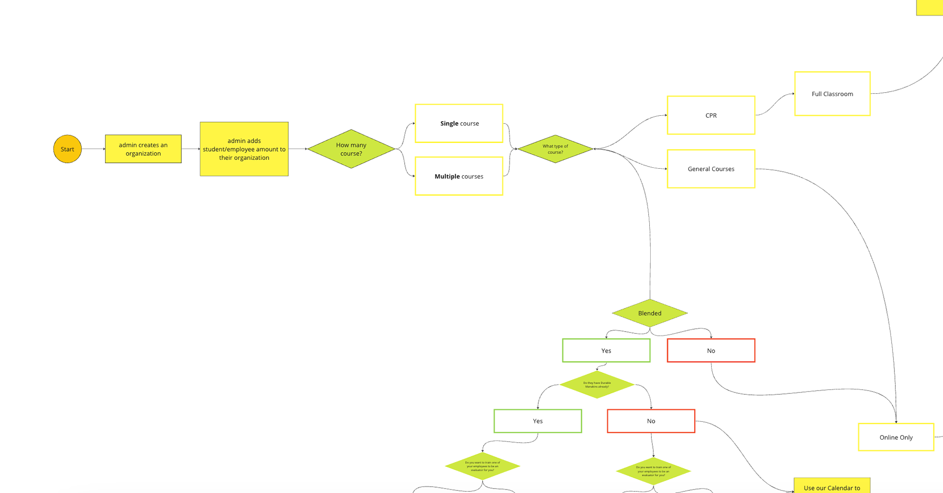
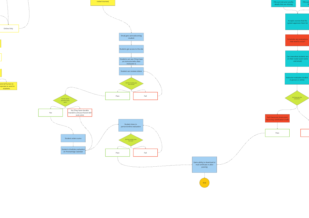
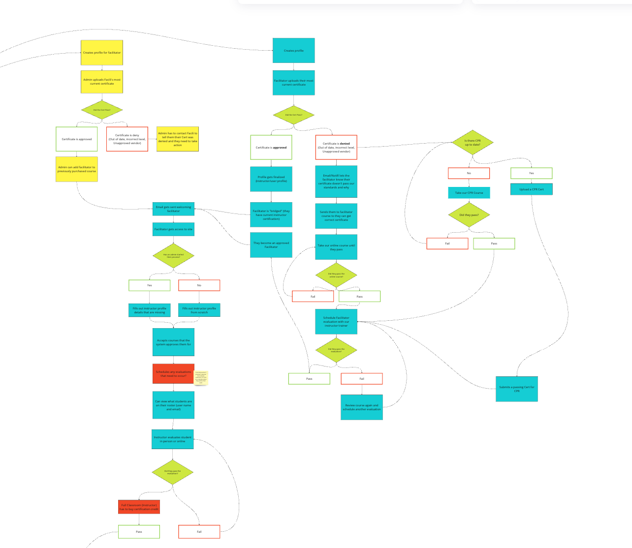
This is the current day process recording of the legacy app before it was redesigned.
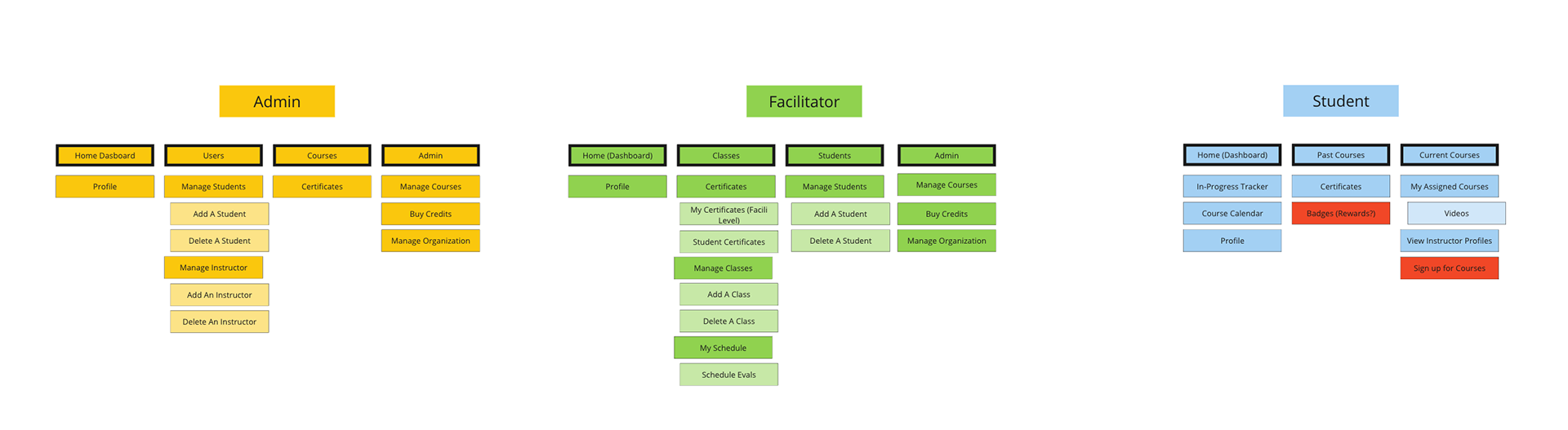
These screens show the user journey created to outline the whole experience. The different users are outlined by different colors, yellow, blue, and blue-green rectangles, whereas decisions are marked by green triangles.
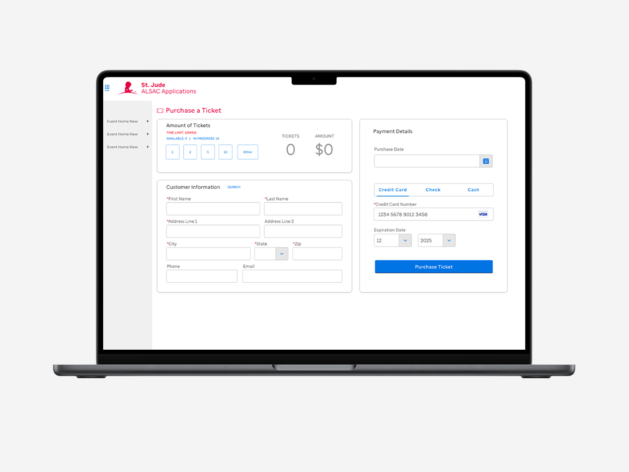
Version 1 of Hi-Fid Designs.
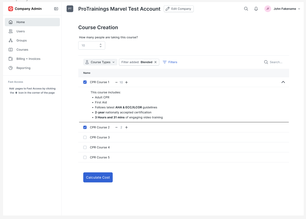
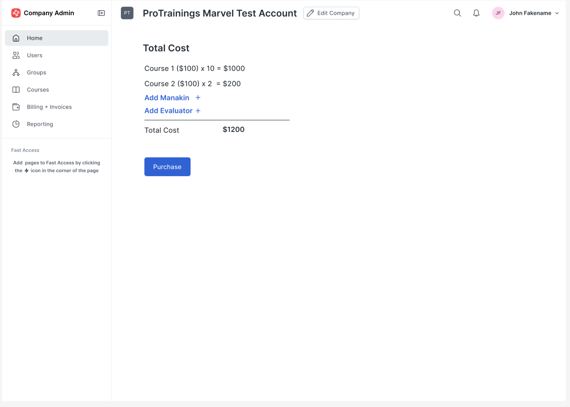
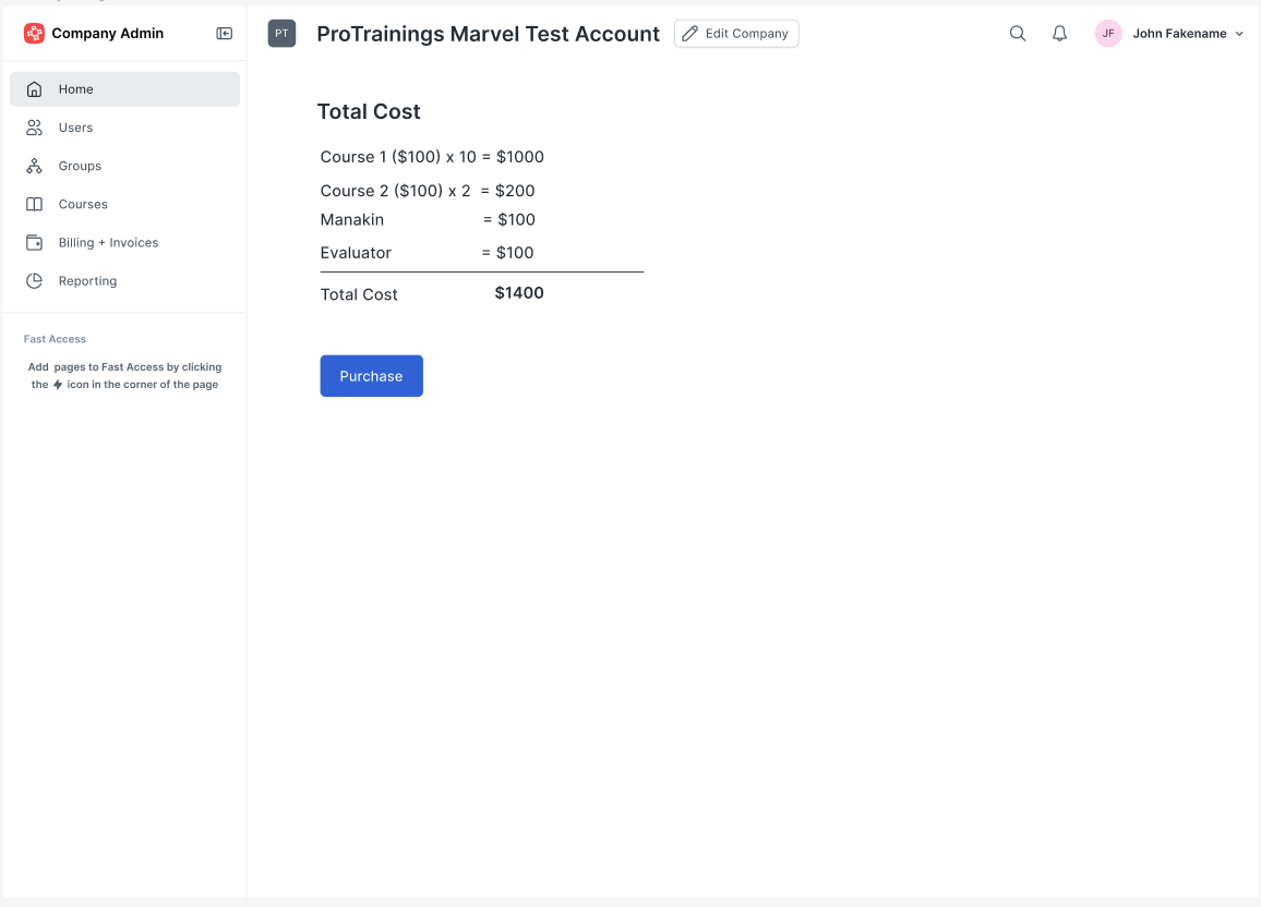
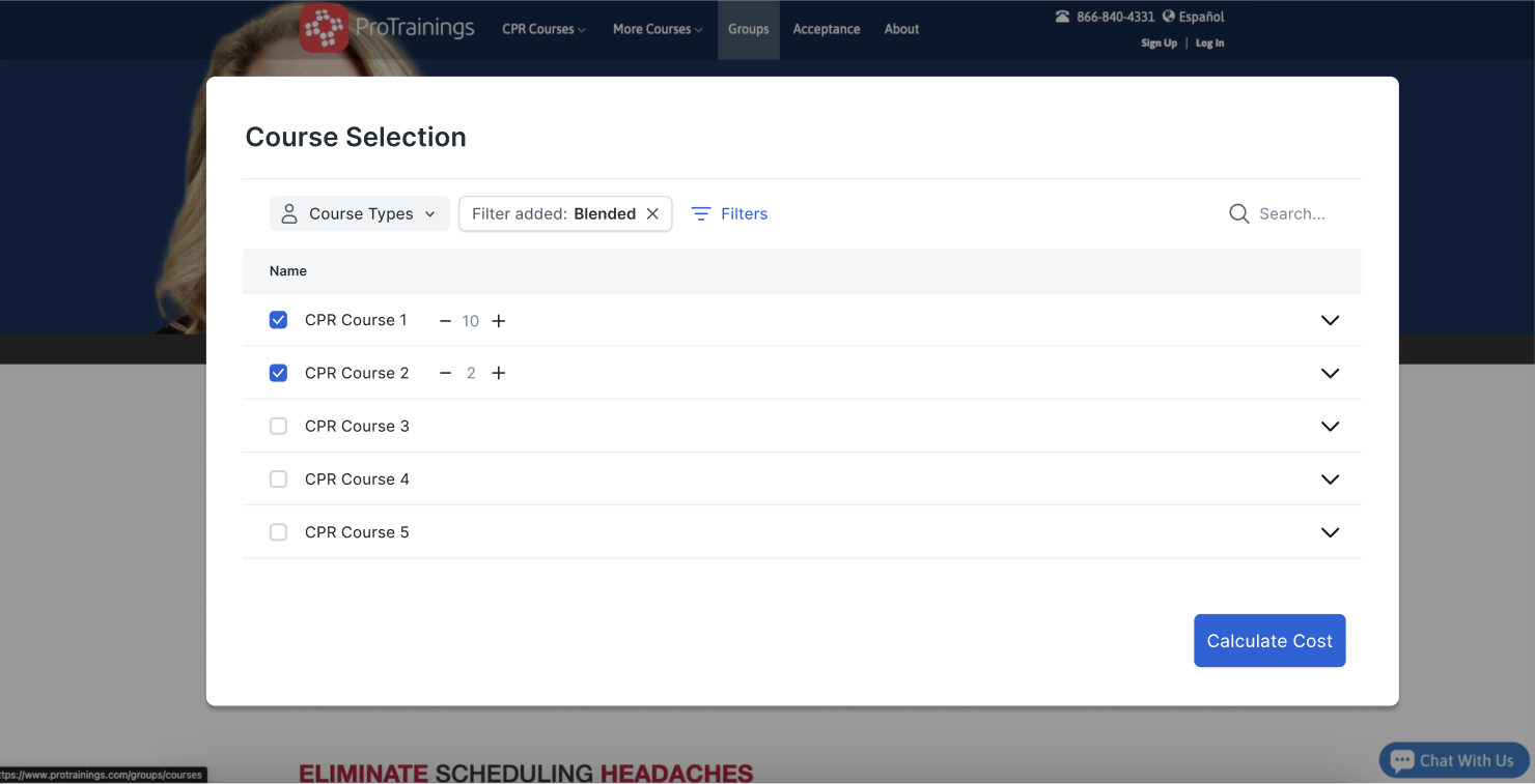
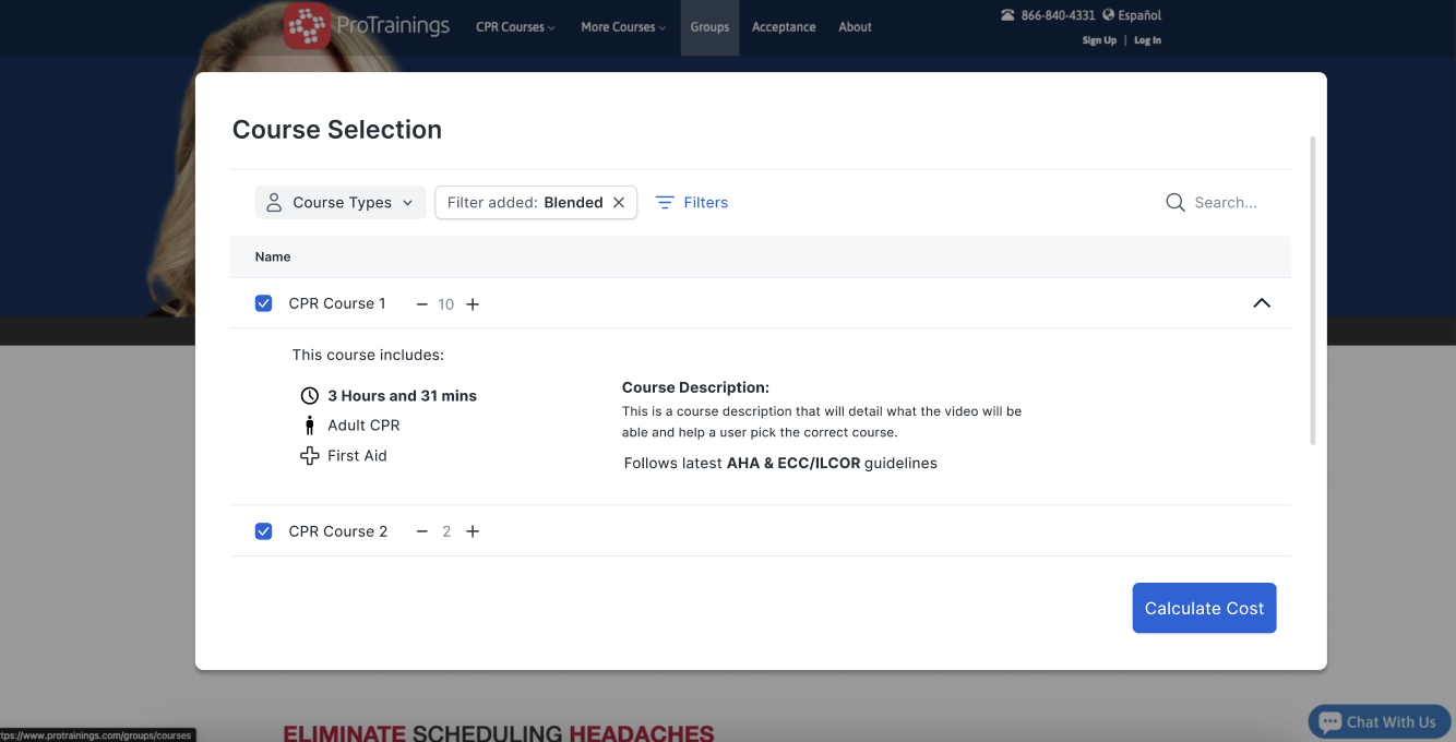

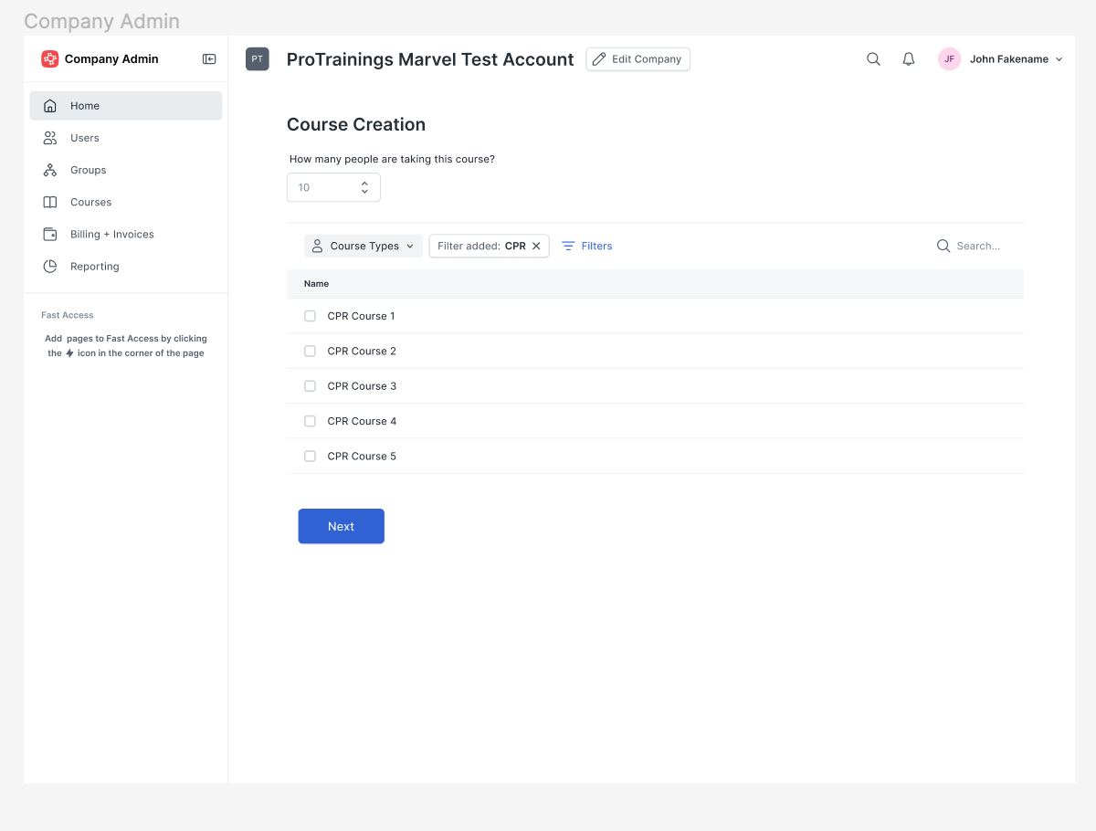
Hi-Fid Wireframes (Final Design)
Result:
The redesigned payment processing system was significantly more intuitive and user-friendly. Users could now easily understand where they were in the process and how many courses they were signing up for without feeling overwhelmed. The minimal design approach and the focus on providing only the necessary information at each step helped reduce confusion and the need for customer support intervention.
By focusing on the principles of Visibility of System Status and Flexibility and Efficiency of Use, the new design empowered users to navigate the course selection process with confidence and clarity. This not only improved the user experience but also reduced the burden on customer support, as users were better able to complete their course registrations independently.