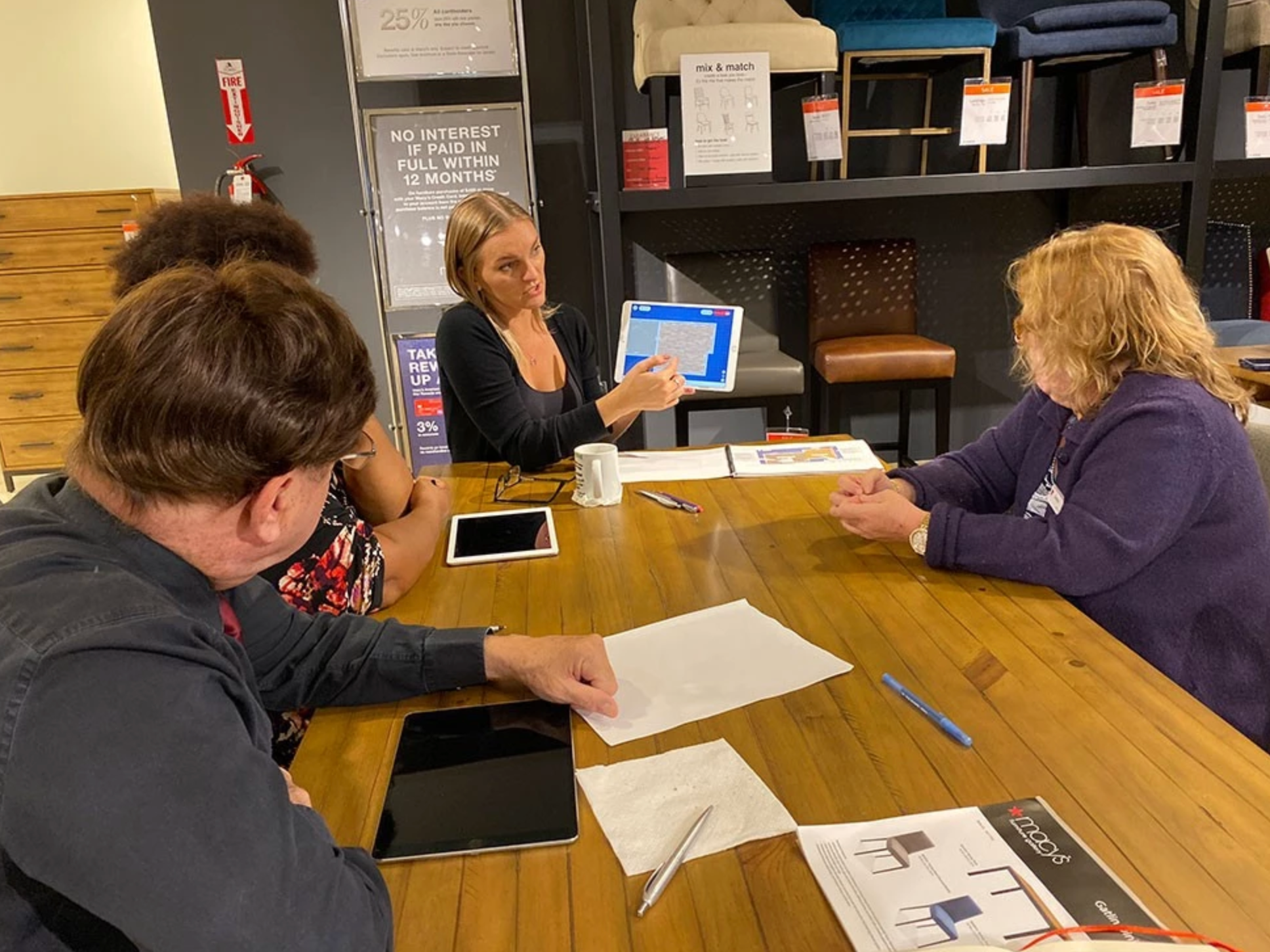
Situation:
Robern, a well-known brand for luxury bathroom vanities, transitioned to our platform from a previous app we built for them. This new platform allowed users to create an entire room layout, rather than just change the vanity, making it a more comprehensive tool. The Vanity Builder, which was initially designed for professional designers to showcase products to consumers, needed to be adapted for regular consumers on Robern’s main website. Due to time and scope constraints, we opted for a 2D visualizer that allowed users to input 3D products into the scene instead of building a fully 3D environment.
Robern, a well-known brand for luxury bathroom vanities, transitioned to our platform from a previous app we built for them. This new platform allowed users to create an entire room layout, rather than just change the vanity, making it a more comprehensive tool. The Vanity Builder, which was initially designed for professional designers to showcase products to consumers, needed to be adapted for regular consumers on Robern’s main website. Due to time and scope constraints, we opted for a 2D visualizer that allowed users to input 3D products into the scene instead of building a fully 3D environment.
Task:
Redesign a legacy product within two weeks while adhering to all business rules, ensuring that it would be user-friendly for both professional designers and regular consumers.
Redesign a legacy product within two weeks while adhering to all business rules, ensuring that it would be user-friendly for both professional designers and regular consumers.
Action:
The redesign process was heavily informed by ongoing user feedback, which led to several iterations of the app. Two key principles from Nielsen Norman’s usability heuristics guided this process:
The redesign process was heavily informed by ongoing user feedback, which led to several iterations of the app. Two key principles from Nielsen Norman’s usability heuristics guided this process:
Match Between the System and the Real World: This principle is about designing the interface to reflect real-world experiences and expectations, using language and visuals that users are familiar with. In the context of the Vanity Builder, it was crucial to make the system feel intuitive and relatable. To achieve this, I thoroughly studied Robern's design guidelines, which included understanding all possible combinations of cabinets and vanities. Based on these notes, I created wireframes that depicted every possible combination, ensuring that the app's layout and functionality mirrored the real-world assembly of cabinets.
The importance of this principle became evident as users struggled with the initial design, which didn't adequately reflect the real-world experience of arranging cabinets. The original app had a complicated interface that made it difficult for users to visualize how different cabinets would look together. By incorporating real-world references and ensuring that the design language was familiar, we were able to create a more intuitive experience that aligned with users' expectations.
The importance of this principle became evident as users struggled with the initial design, which didn't adequately reflect the real-world experience of arranging cabinets. The original app had a complicated interface that made it difficult for users to visualize how different cabinets would look together. By incorporating real-world references and ensuring that the design language was familiar, we were able to create a more intuitive experience that aligned with users' expectations.
User Control and Freedom: This principle focuses on allowing users to easily navigate the system, make changes, and explore options without fear of making mistakes. In the initial version of the app, users could simultaneously adjust physical and visual features, which proved too complex, especially for novice users. This complexity restricted their freedom to experiment and led to frustration.
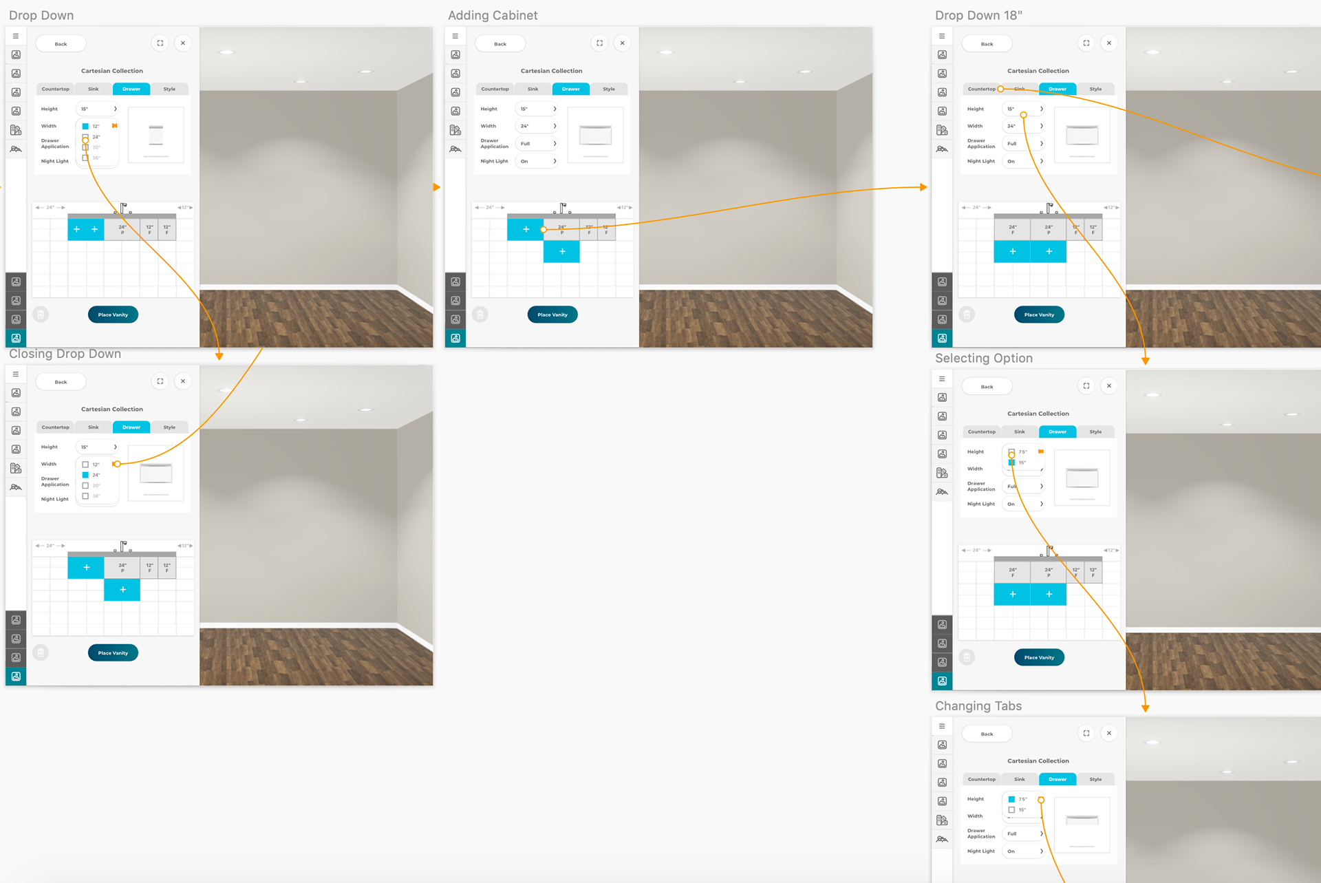
To address this, we simplified the interface by separating physical traits from visual traits. This allowed users to first select the size of the vanity and then choose the visual features, like color and style. This approach not only simplified the decision-making process but also gave users greater control over their choices, making it easier for them to explore different configurations without getting overwhelmed. Additionally, the drag-and-drop functionality we introduced allowed both expert designers and regular consumers to easily interchange cabinets and adjust their layout, further enhancing user freedom and making the app more versatile.
To address this, we simplified the interface by separating physical traits from visual traits. This allowed users to first select the size of the vanity and then choose the visual features, like color and style. This approach not only simplified the decision-making process but also gave users greater control over their choices, making it easier for them to explore different configurations without getting overwhelmed. Additionally, the drag-and-drop functionality we introduced allowed both expert designers and regular consumers to easily interchange cabinets and adjust their layout, further enhancing user freedom and making the app more versatile.
Throughout the redesign, I relied heavily on the feedback from continuous testing. Each iteration of the app addressed specific pain points identified by users, leading to a product that was more aligned with their needs. By iterating based on real-world feedback, we ensured that the app was not only functional but also highly usable.
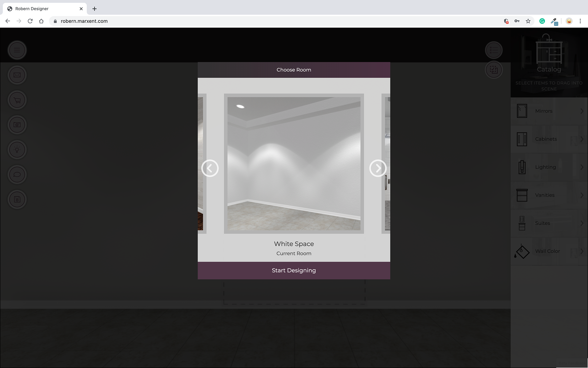
Initial Welcome Screen
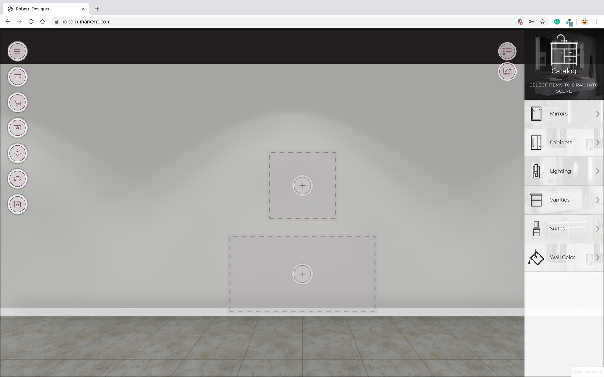
3D scene
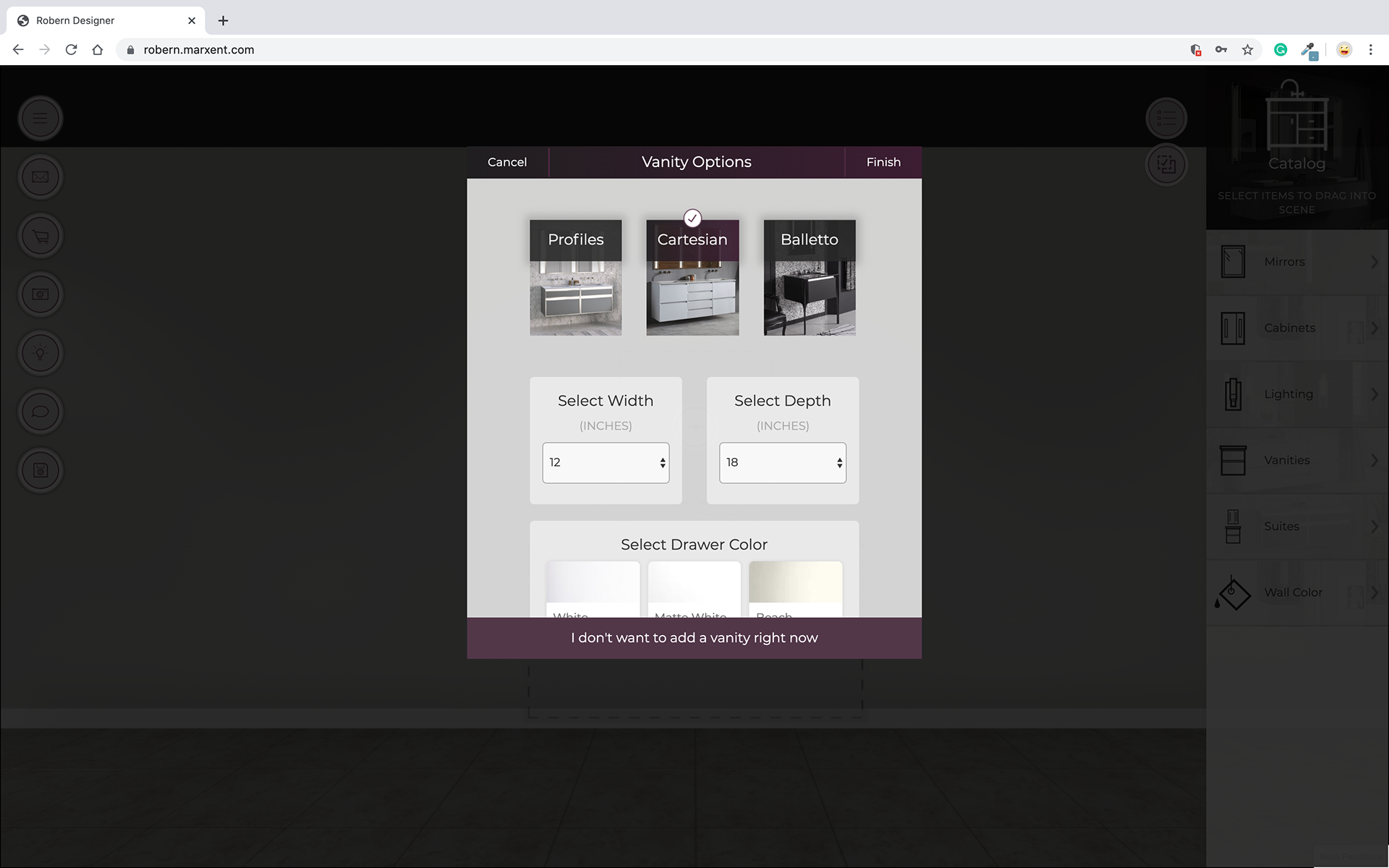
Adding A Vanity
Placed Vanity
The legacy app before it was redesigned.
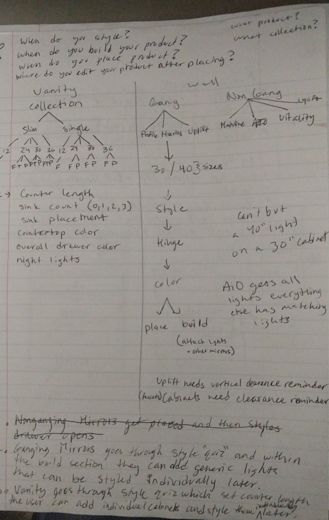

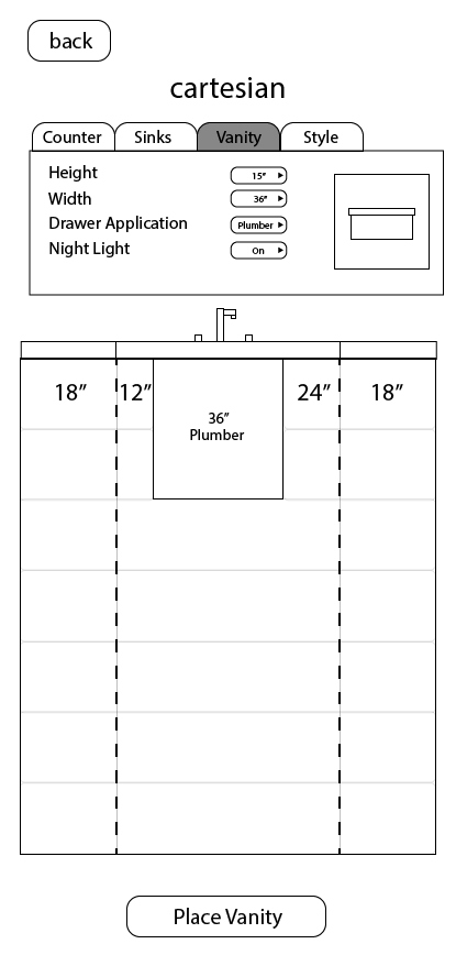
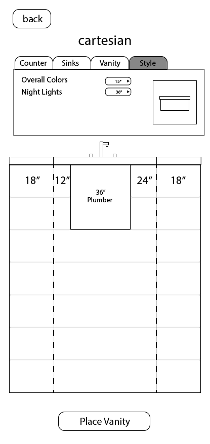
Initial Wireframes and documentation of business rules. The different numbers in the decision tree are the different drawer sizes.
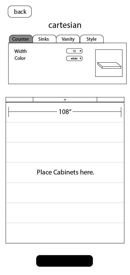
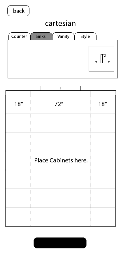
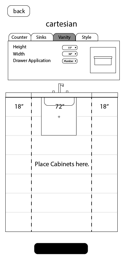
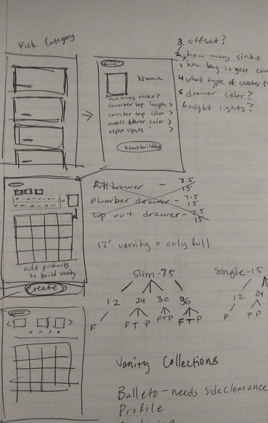
First Draft Low Fidelity Wireframes

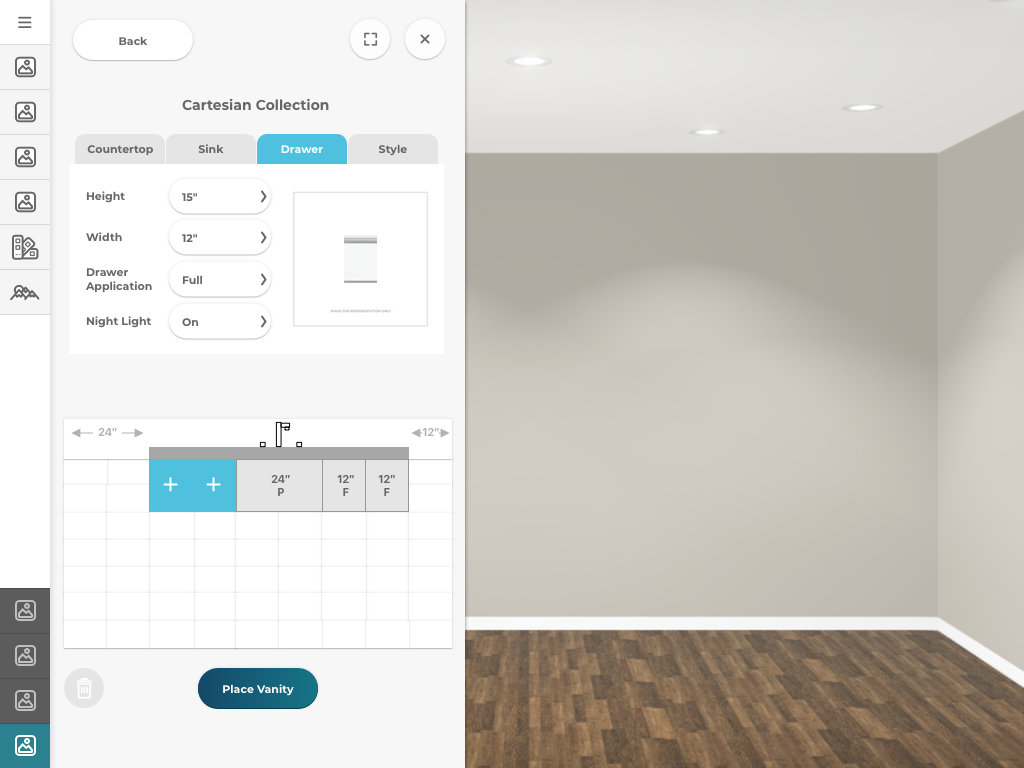
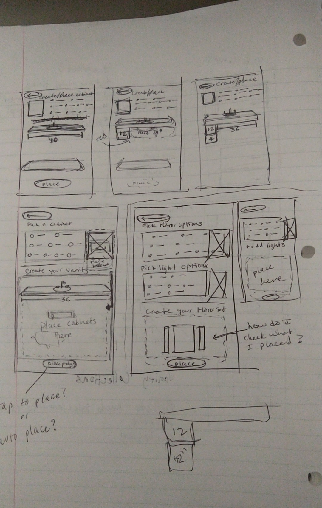
Second Draft High Fidelity Wireframes and Sketch Prototype
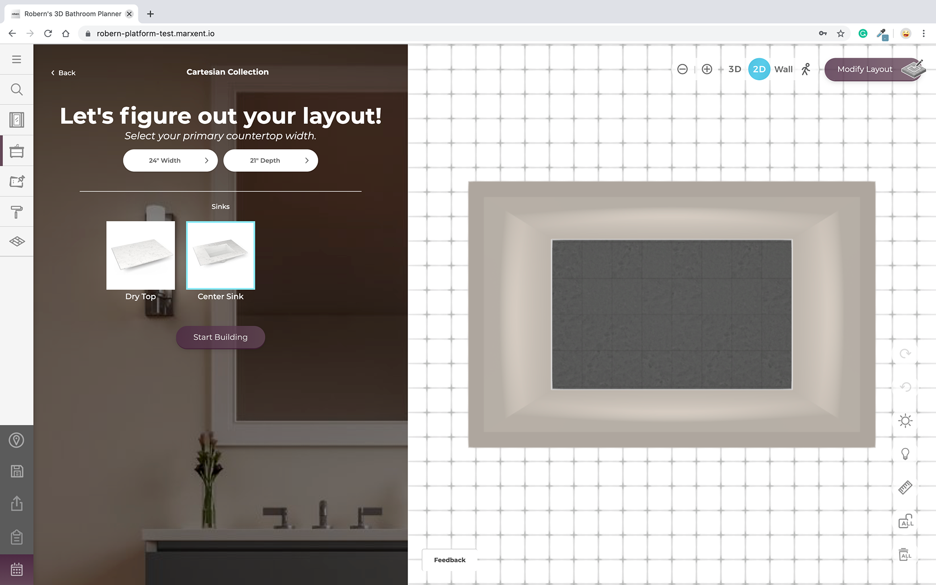
Initial Welcome Screen
Configurator and Products
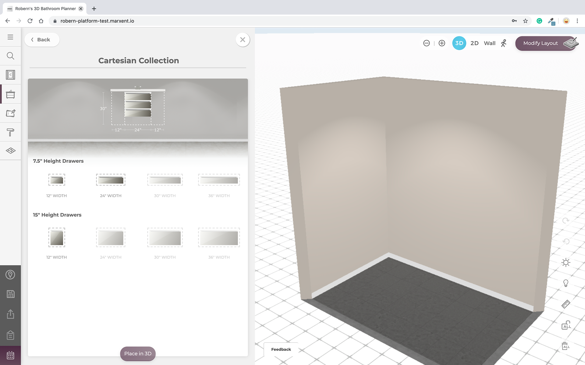
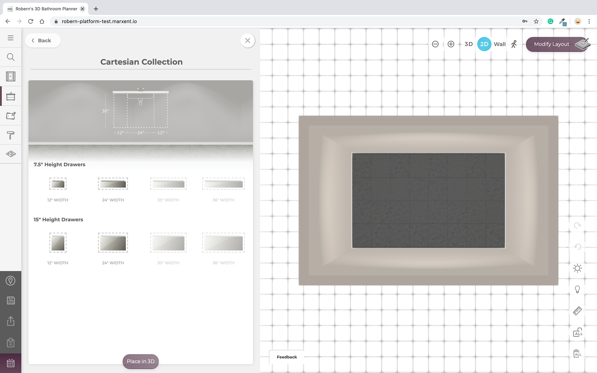
Building Vanity
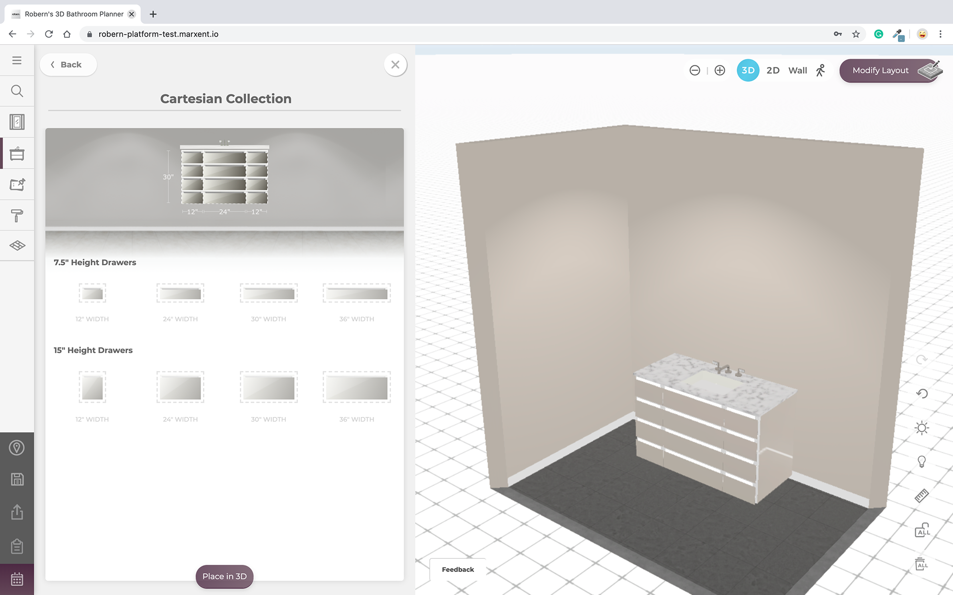
Placing Final Product
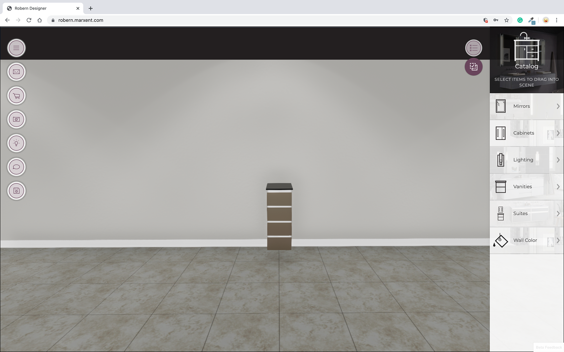
Hi-Fid Wireframes (Final Design)
Results:
The final product delivered a much-improved experience for both the client's designers and novice users. The new feature allowing users to drag products into the configurator simplified the process significantly. Instead of having to understand all the intricate rules about which physical traits could match with which visual traits, users could now select a vanity size first and then explore visual options. This redesign made the app more accessible, allowing users to easily adjust and interchange cabinets without getting bogged down by the complexity of the combinations.
The final product delivered a much-improved experience for both the client's designers and novice users. The new feature allowing users to drag products into the configurator simplified the process significantly. Instead of having to understand all the intricate rules about which physical traits could match with which visual traits, users could now select a vanity size first and then explore visual options. This redesign made the app more accessible, allowing users to easily adjust and interchange cabinets without getting bogged down by the complexity of the combinations.
By focusing on the principles of Match Between the System and the Real World and User Control and Freedom, the redesigned Vanity Builder became a more intuitive, flexible, and user-friendly tool, ultimately meeting the needs of both professional designers and everyday consumers.