
Situation:
St. Jude Children’s Research Hospital needed a redesigned ticketing system to manage both online and in-person ticket sales for Dream Home Tickets. The existing system was outdated, which presented opportunities for significant user experience improvements. My role involved not just redesigning the user interface but also deeply understanding the various user roles involved and ensuring the new system would meet their needs efficiently.
St. Jude Children’s Research Hospital needed a redesigned ticketing system to manage both online and in-person ticket sales for Dream Home Tickets. The existing system was outdated, which presented opportunities for significant user experience improvements. My role involved not just redesigning the user interface but also deeply understanding the various user roles involved and ensuring the new system would meet their needs efficiently.
Task:
Redesign the ticketing system to make it more consistent and user-friendly while maintaining a minimalist design that would be aesthetically pleasing and easy to navigate. I was also responsible for creating a design system that could be used across other apps within St. Jude’s organization.
Redesign the ticketing system to make it more consistent and user-friendly while maintaining a minimalist design that would be aesthetically pleasing and easy to navigate. I was also responsible for creating a design system that could be used across other apps within St. Jude’s organization.
Action:
For this project, I focused on two key principles from Nielsen Norman’s usability heuristics:
For this project, I focused on two key principles from Nielsen Norman’s usability heuristics:
Consistency and Standards (4th Principle): This principle emphasizes the importance of maintaining consistency throughout a design so that users do not have to wonder whether different words, situations, or actions mean the same thing. Consistency in design reduces the user’s cognitive load and makes the system more intuitive.
The existing St. Jude system suffered from inconsistencies in its user interface, making it difficult for users to navigate and complete tasks. To address this, I began with extensive exploratory research to understand the roles of different users within the system. This research involved creating detailed personas and user journey maps, which helped identify key pain points and opportunities for improvement.
After developing a thorough understanding of the users and their needs, I ensured that the redesigned system maintained consistency across all elements. This included consistent labeling, messaging, and visual elements that aligned with the users’ expectations. By doing so, I minimized the learning curve and made the system more predictable and easier to use, which was especially important given the diverse user base.
Aesthetic and Minimalist Design (8th Principle): This principle advocates for a design that avoids unnecessary elements and ensures that only relevant information is presented to users. A clean, minimalist design not only enhances the visual appeal but also helps users focus on what is important without being distracted by extraneous content.
Given the outdated nature of the existing system, I focused on creating a design that was both aesthetically pleasing and functionally efficient. The content itself wasn’t overly problematic, but it needed better organization and presentation. By adopting a minimalist design approach, I stripped away unnecessary elements and focused on delivering a streamlined, clutter-free interface.
I had the advantage of conducting extensive user testing—the most comprehensive I’ve ever done for any project. I assembled a group of users representing all the personas I had developed, and before each sprint, I conducted testing sessions to gather feedback. This iterative testing process allowed me to fine-tune the design, ensuring that it was not only visually clean but also met the practical needs of the users.
Through these testing sessions, I consistently received feedback that validated the minimalist approach. Users appreciated the clear, organized layout that made it easy to find and interact with the essential features without being overwhelmed by unnecessary details.

Created documentation to track which users I spoke to and helped give me a general understanding of the current product.
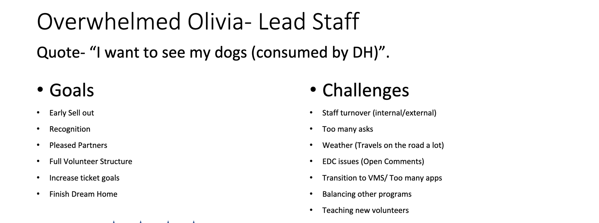
After talking to several users I created personas that would help me when creating my personas.
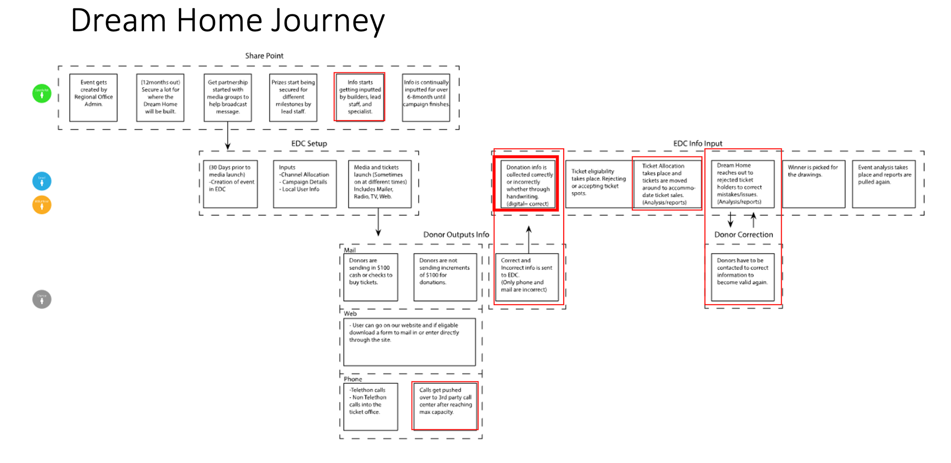
After understanding who the users were I did a general journey map that showed how an event would take place and what the major pain points were.

After interviewing several users I wrote down each problem I heard.
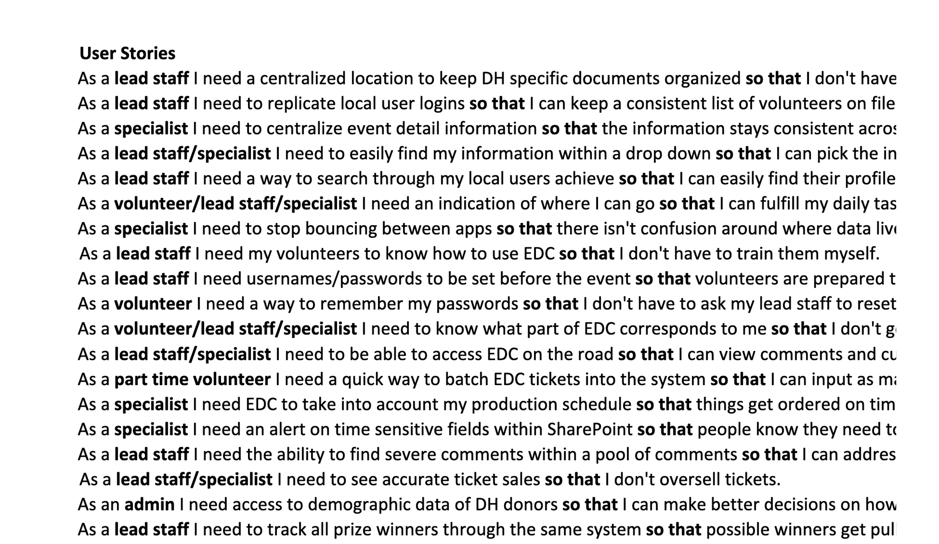
I took each problem I heard and grouped them into categories and created user stories from said issues.
This is my exploratory research. I conducted several user 1-on-1 sessions in order to get to know the end-users and the differences in their personas.

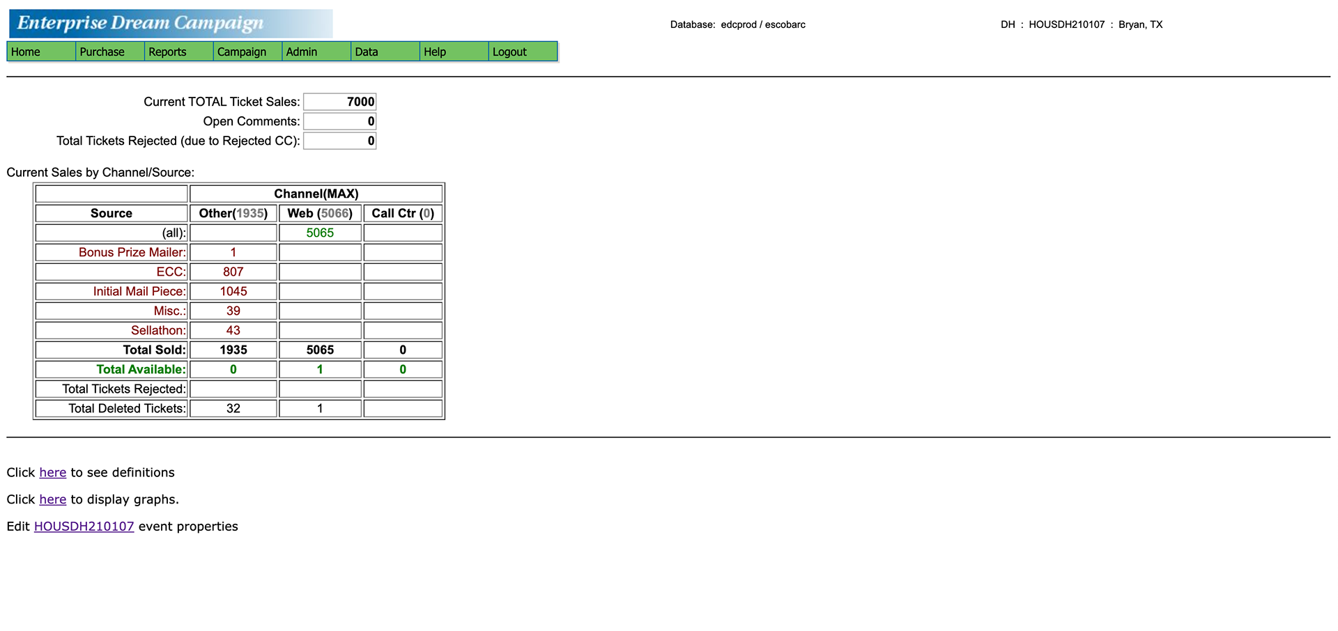

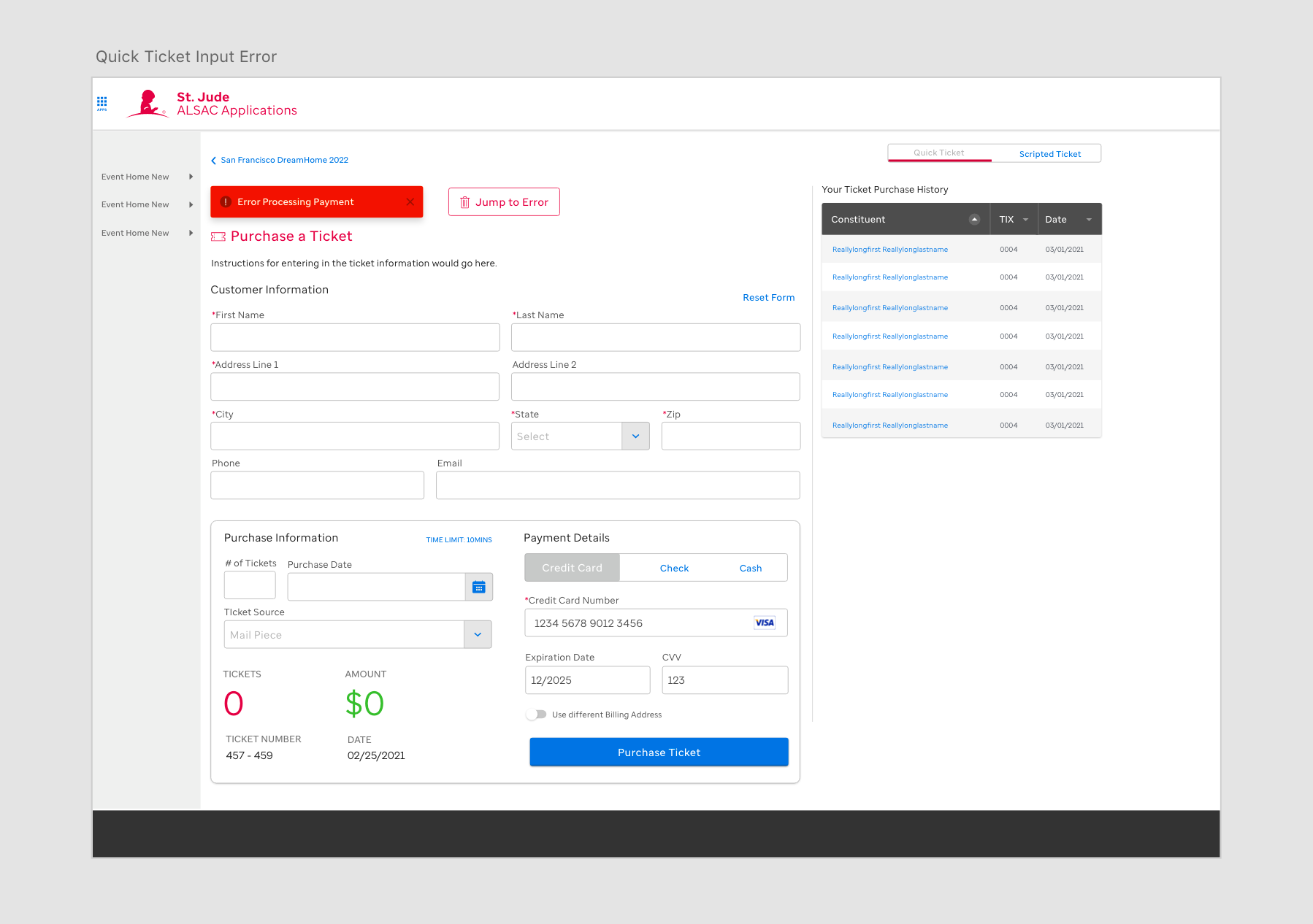
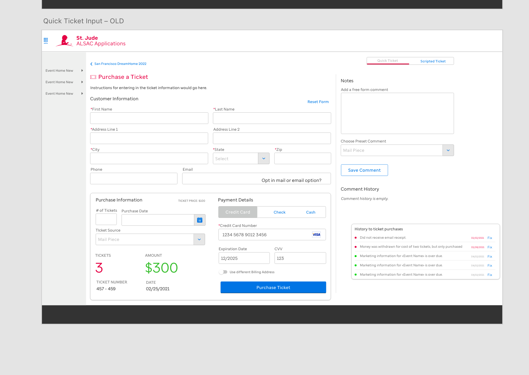
This is the legacy app before it was redesigned.
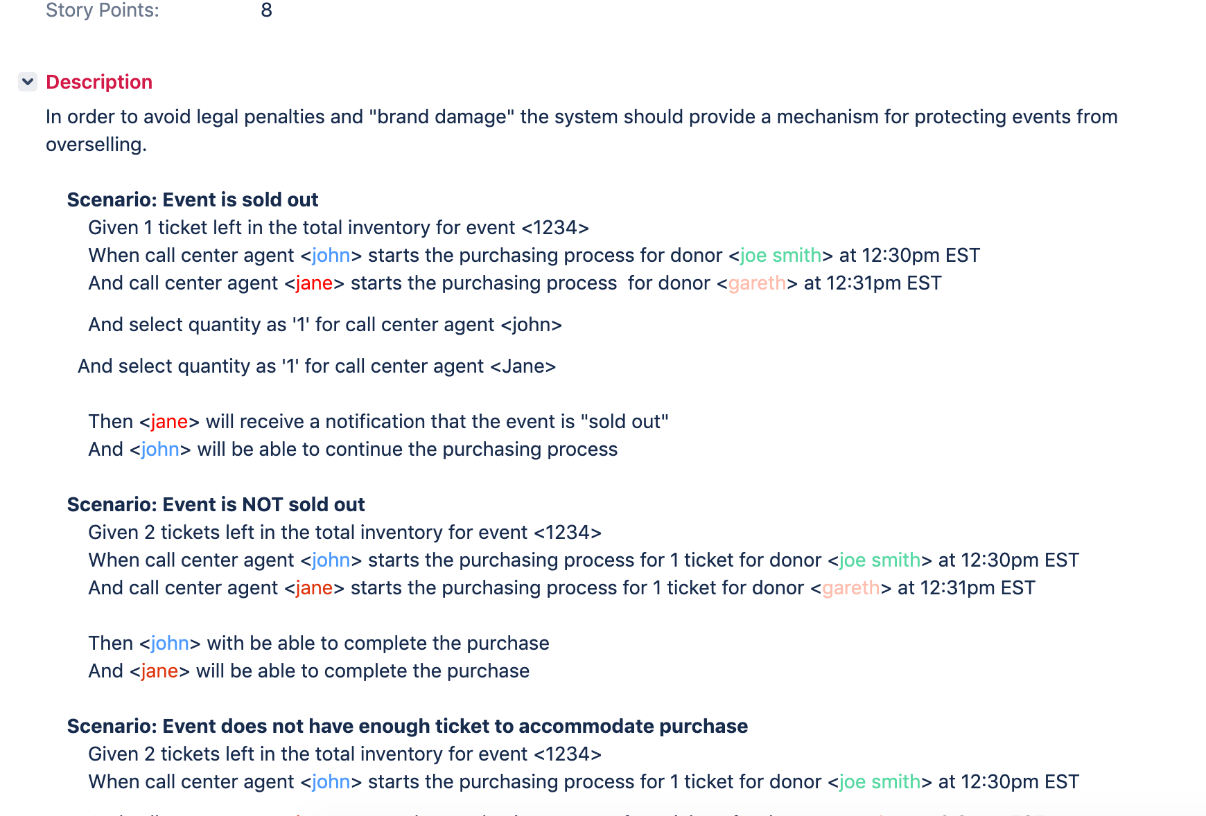
This screen shows what a Give When Statement is.
Draft 1
Draft 2
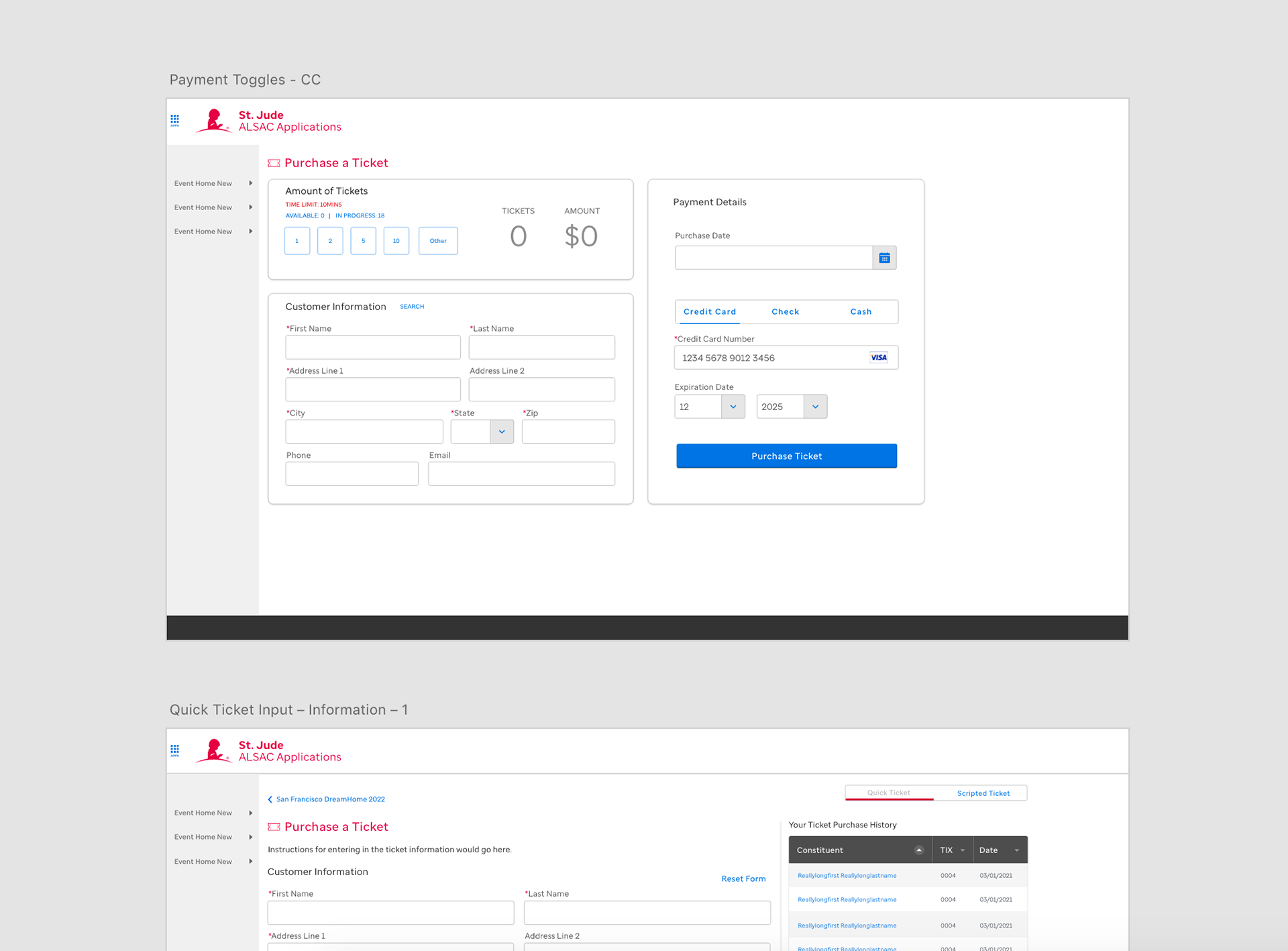
Final Version
Here I am writing out a Given When Statement that helps define the key scenarios and what the developers should expect to build. Alongside that are variations of the main screen where you purchase tickets from. I would create the different versions to understand what could be possible but I would work with the team to narrow it down to what would be the MVP which is seen in the last version of that example.
This shows that a key example might look like.
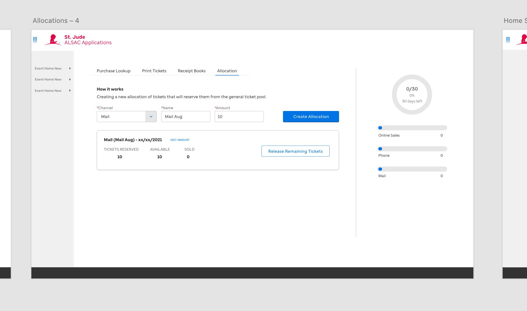
Sometimes tickets needed to be put aside and this feature helped do so.
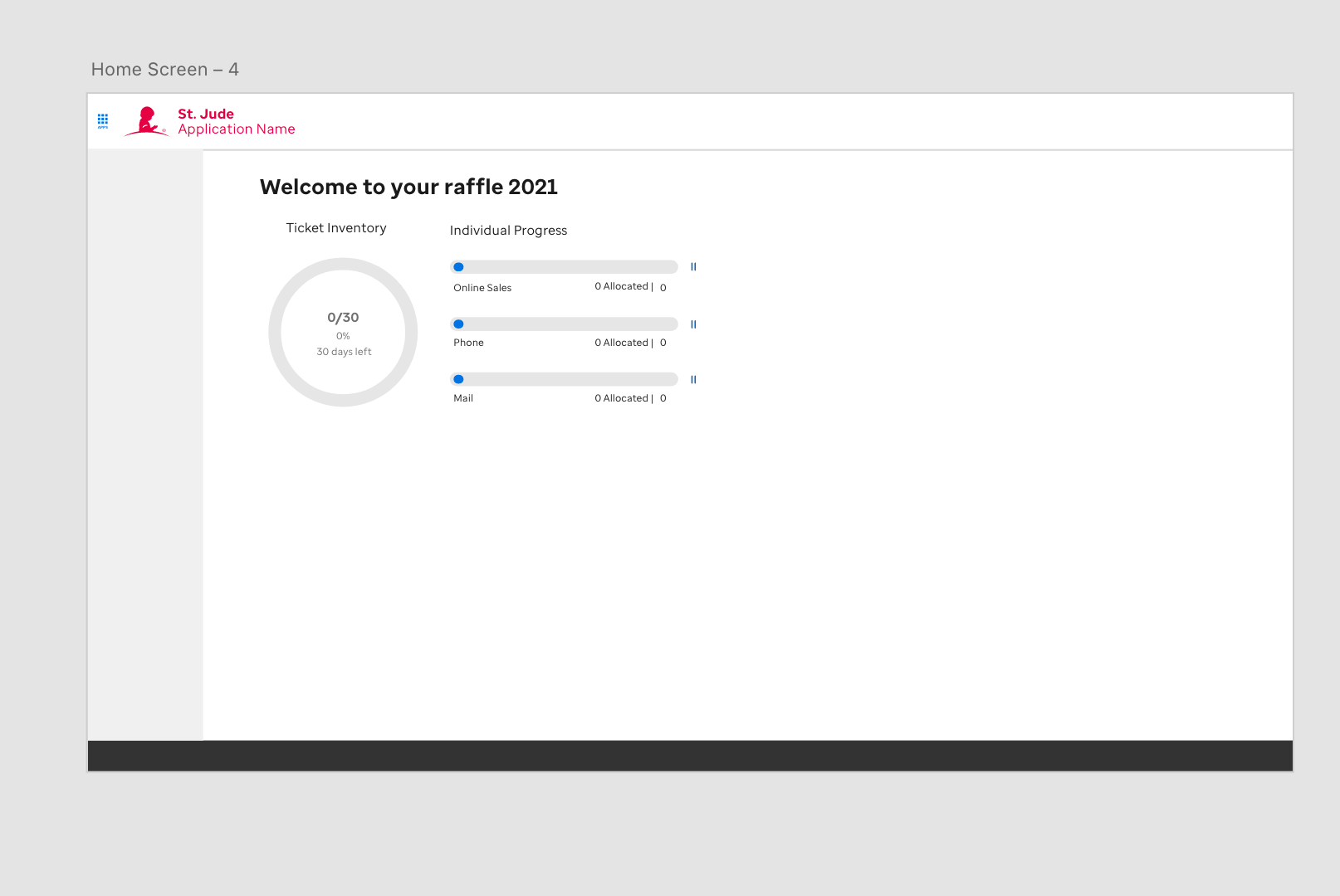
This was the user's home screen. As we develop I continue to add more things to this home dash board.
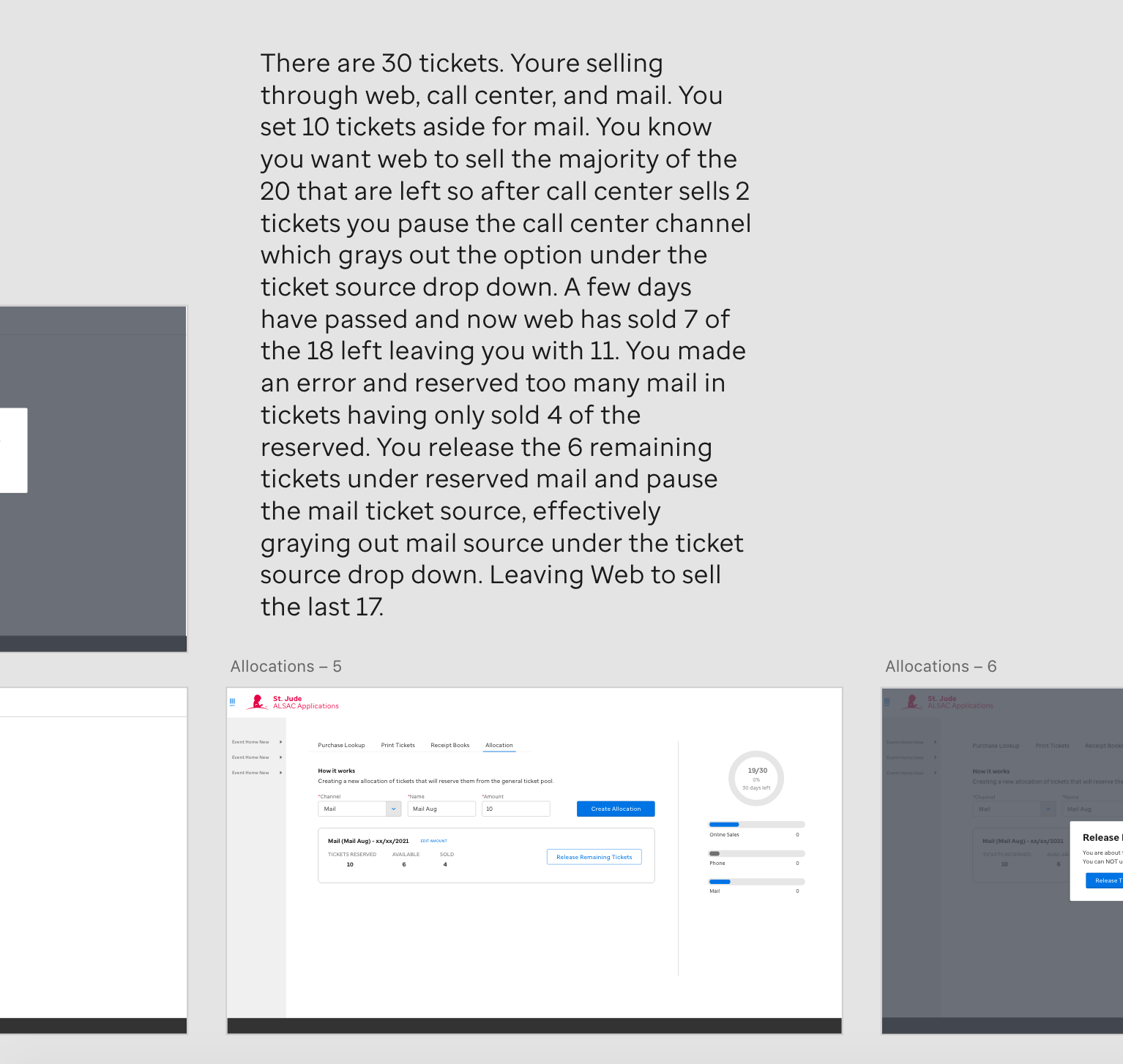
These screens depict tickets being moved from one channel to another. I took the scenario and created a flow to help explain to the team what was needed in order to move tickets around. This was important because if ticket management was mishandled and tickets went unaccounted for during the transition process it could mean an incorrect amount of tickets being sold which could risk the integrity of the raffle.
Result:
The redesigned ticketing system was a success, providing a much more consistent and visually appealing experience for the users. By adhering to the principles of Consistency and Standards and Aesthetic and Minimalist Design, I was able to transform an outdated system into one that was intuitive, user-friendly, and easy to navigate.
The redesigned ticketing system was a success, providing a much more consistent and visually appealing experience for the users. By adhering to the principles of Consistency and Standards and Aesthetic and Minimalist Design, I was able to transform an outdated system into one that was intuitive, user-friendly, and easy to navigate.
Moreover, the design system I created for this project became the foundation for other apps within St. Jude’s organization. This consistency across different applications not only improved the user experience but also reinforced the brand’s identity and reliability. The extensive user testing I conducted throughout the design process ensured that the final product truly met the needs of the diverse user base, making the ticketing system more efficient and effective for everyone involved.